
2022
Shipped
UX Design
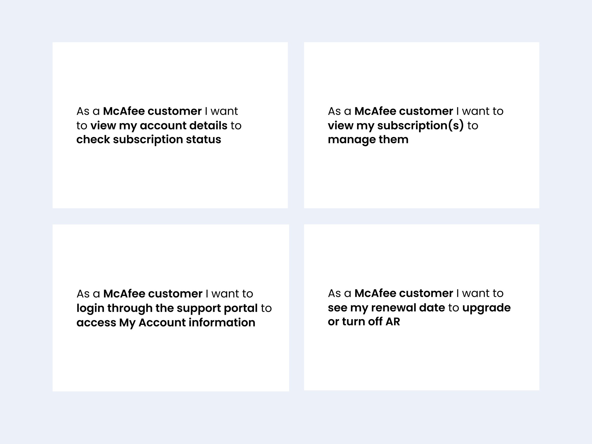
User Stories
User Console: Improving McAfee subscription Transparency, Speeding Up Resolution
User Console: Improving McAfee subscription Transparency, Speeding Up Resolution
I led a redesign to improve subscription transparency, leveraging an underutilized element to provide clear subscription details and account management options. I aimed to reduce support inquiries, user confusion, and bring transparency and agency to the user.
I led a redesign to improve subscription transparency, leveraging an underutilized element to provide clear subscription details and account management options. I aimed to reduce support inquiries, user confusion, and bring transparency and agency to the user.
78% Reduction in
rage clicks
~2 minutes saved
per support incident
(2k+/month) link engagements

Client
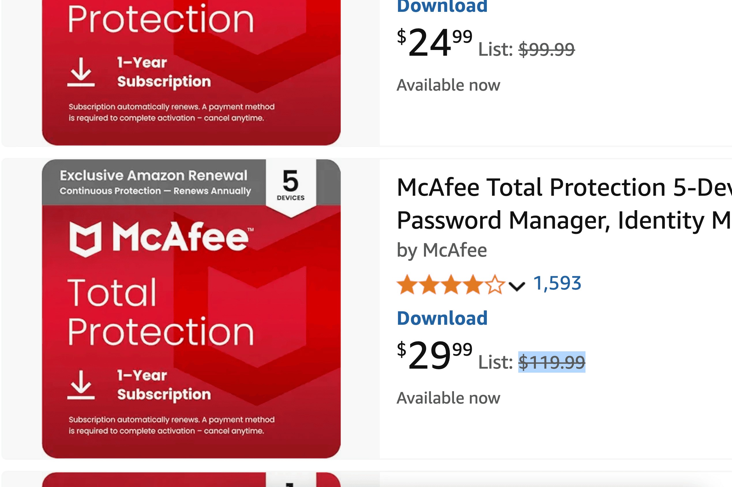
McAfee.com/Support
2022
2024 (Update)
UX Design
Timeline - 2 months
Designer (Me)
Business Architect
Program Manager
Engineering
Data Scientist
Service Delivery
2024 Update
SalesForce Designer
Designer (Me)
Billing Team
Engineering
Timeline - 2 months
Designer (Me)
Business Architect
Program Manager
Engineering
Data Scientist
Service Delivery
2024 Update
SalesForce Designer
Designer (Me)
Billing Team
Engineering
Context
Leveraging an underutilised component
Leveraging an underutilised component
What started as a minor UI tweak—adding a simple link—quickly revealed a much deeper UX problem.
What started as a minor UI tweak—adding a simple link—quickly revealed a much deeper UX problem.
What started as a minor UI tweak—adding a simple link—quickly revealed a much deeper UX problem.
Users were confused about their subscription status, leading to support calls and potential trust issues.
By analyzing behavioral data, customer feedback, and business constraints, I designed a solution that not only provided clarity but also changed how we surfaced critical account information.
The impact? A feature that the business deemed valuable and made it a key feature within the new SalesForce experience.
Observations from Microsoft Clarity
Analysing user behaviour on MS Clarity recordings*
Analysing user behaviour on MS Clarity recordings*
*I pushed for Microsoft Clarity to be installed on the website because, at that time, we had no behavioral analytics tool, and the company wasn't prioritizing user research on the Support website.
*I pushed for Microsoft Clarity to be installed on the website because, at that time, we had no behavioral analytics tool, and the company wasn't prioritizing user research on the Support website.
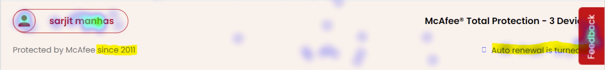
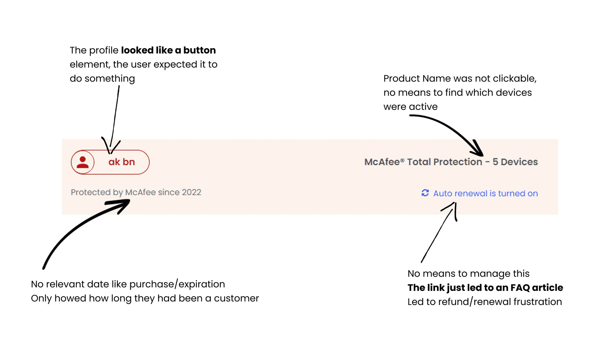
Repeated Clicks on User Name/Icon
Users consistently clicked on their name and an adjacent icon in the banner. This behavior strongly indicated an expectation for more than just their account name and membership duration; they were clearly looking for actionable account information.
Repeated Clicks on User Name/Icon
Users consistently clicked on their name and an adjacent icon in the banner. This behavior strongly indicated an expectation for more than just their account name and membership duration; they were clearly looking for actionable account information.
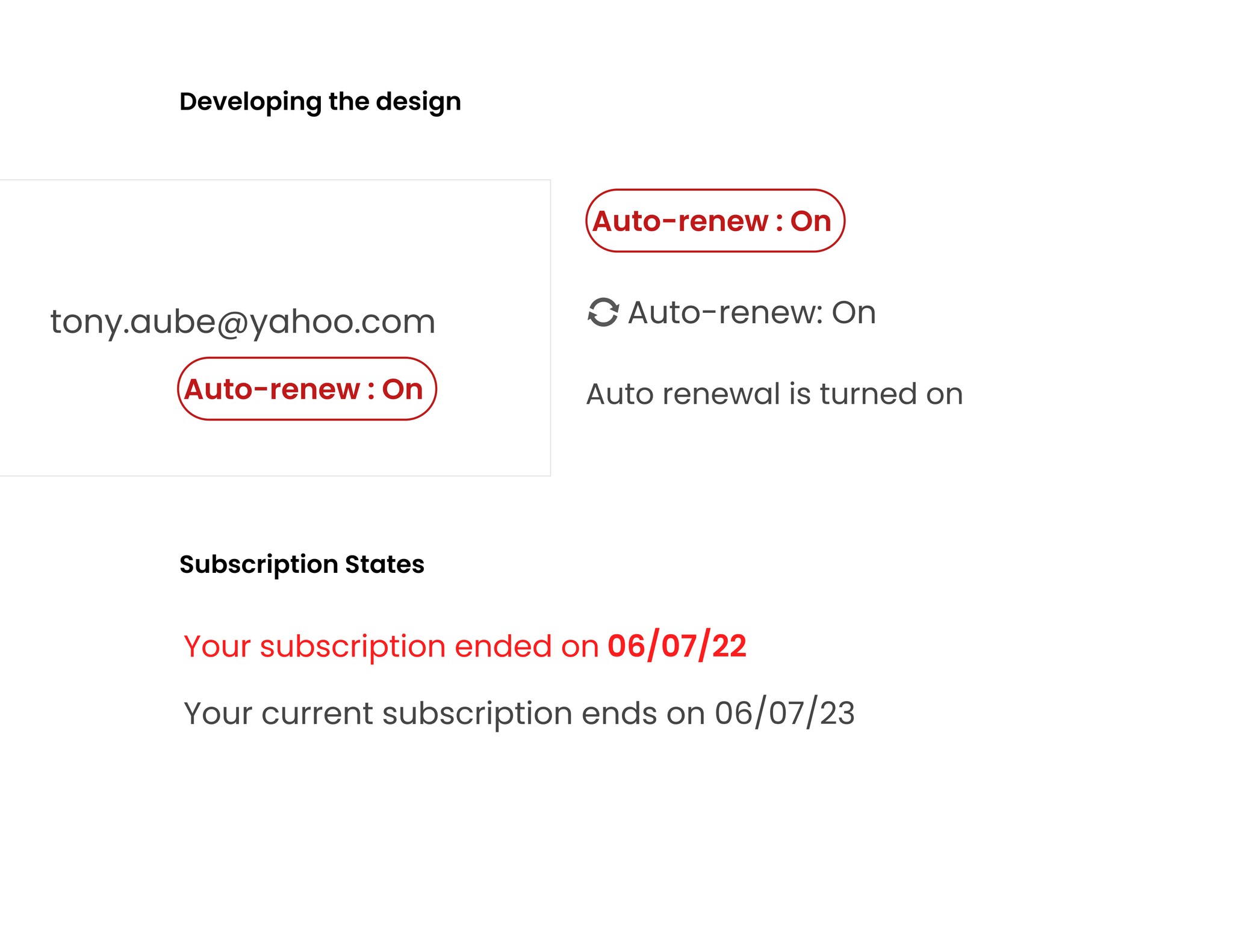
Inactionable Auto-Renewal Status
While users understood that auto-renewal (AR) was enabled, they lacked the ability to easily change this setting. This highlighted a significant gap in user control and agency over their subscription.
Inactionable Auto-Renewal Status
While users understood that auto-renewal (AR) was enabled, they lacked the ability to easily change this setting. This highlighted a significant gap in user control and agency over their subscription.
Our users lacked crucial account related information.
Or did they?
Our users lacked crucial account related information.
Or did they?
At first glance, this seemed like a simple usability issue—users were clicking on an unresponsive banner expecting it to lead somewhere. But instead of stopping at just making the banner interactive, I dug deeper into the problem.
At first glance, this seemed like a simple usability issue—users were clicking on an unresponsive banner expecting it to lead somewhere. But instead of stopping at just making the banner interactive, I dug deeper into the problem.
Digging deeper - Asking WHY?
Digging deeper - Asking WHY?
Pulling information from different sources
Pulling information from different sources
I dug deeper by analyzing customer support tickets, chat transcripts, and user feedback.
I dug deeper by analyzing customer support tickets, chat transcripts, and user feedback.
I grouped comments by theme and came across distinct needs
I grouped comments by theme and came across distinct needs
"When does my Mcafee get over??"
Subscription Confusion:
People received renewal emails and wanted to confirm whether they had already paid since they recall when they'd last made a purchase.
Subscription Confusion:
People received renewal emails and wanted to confirm whether they had already paid since they recall when they'd last made a purchase.
"I received an email about a charge am I being scammed.
I already paid for this?"
Scam or legitimate charge:
Users questioned the validity of unexpected charges. It was difficult to differentiate because we had a spike in cybercrime at the time and the scam emails mimicked real invoices.
Scam or legitimate charge:
Users questioned the validity of unexpected charges. It was difficult to differentiate because we had a spike in cybercrime at the time and the scam emails mimicked real invoices.
"I JUST want to know when my subscription expires!!"
Account info access:
They didn’t know where to find their subscription or payment details.
Account info access:
They didn’t know where to find their subscription or payment details.
"Why am I getting multiple charges on my credit card???"
Duplicate subscriptions:
Users were accidentally purchasing multiple subscriptions, leading to redundant charges.
Duplicate subscriptions:
Users were accidentally purchasing multiple subscriptions, leading to redundant charges.
"When does my subscription expire?"
"When does my subscription expire?"
At first, this seemed like a straightforward request. But why were so many people asking this? What was making them unsure about their expiration date?
I traced the issue back further and found three major underlying problems:
At first, this seemed like a straightforward request. But why were so many people asking this? What was making them unsure about their expiration date?
I traced the issue back further and found three major underlying problems:
The underlying causes of this behaviour
The underlying causes of this behaviour
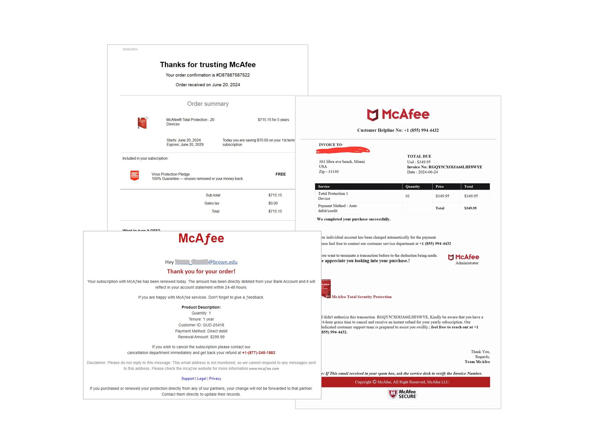
Users received both real and fraudulent emails about subscription expirations
They couldn't tell whether an email was legitimate or a phishing attempt.
This uncertainty led them to log in and try to confirm their subscription status—only to be met with a banner that gave them no relevant information.
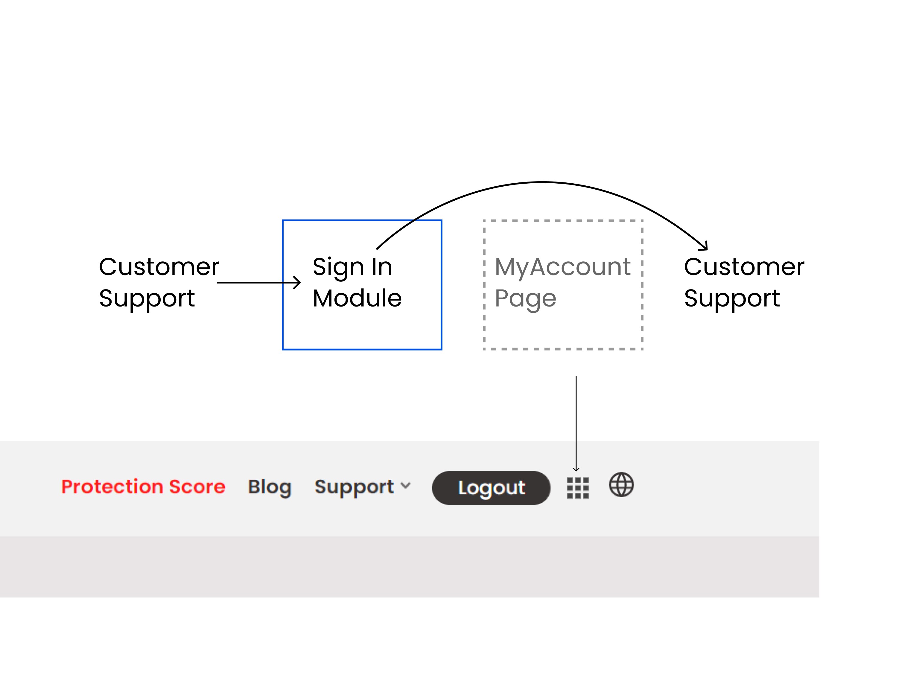
The "My Account" section was buried in a bento menu, requiring multiple clicks
When users logged in, they had no immediate visibility into their current plan, expiration date, or active subscriptions.
'Sticker shock' led to new subscription purchases instead of renewals
As a result, customers unintentionally ended up with multiple active subscriptions.
Even after purchasing a new one, they would continue receiving emails about their old plan expiring—leading to even more confusion and frustration.
The insight
The insight
The real issue was a lack of transparency and control over their subscriptions.
The real issue was a lack of transparency and control over their subscriptions.
What could be done with the existing banner?
What could be done with the existing banner?
Initial Solution
Initial Solution
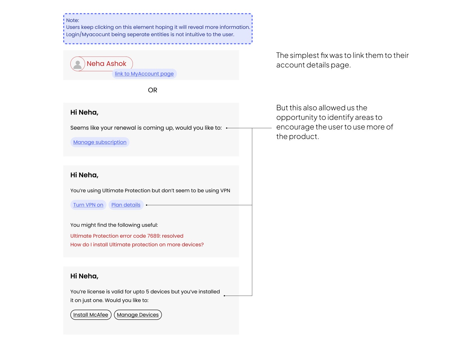
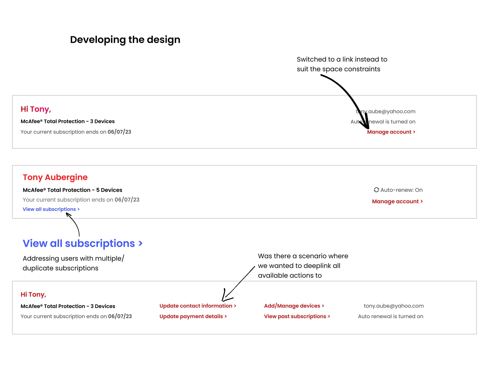
Hyperlink the Name/Button element to the Account page
Hyperlink the Name/Button element to the Account page
Initially, the easy fix seemed to be just hyperlinking the banner to the "My Account" page.
But knowing the depth of the problem, I pushed for a smarter, more impactful solution:
Initially, the easy fix seemed to be just hyperlinking the banner to the "My Account" page.
But knowing the depth of the problem, I pushed for a smarter, more impactful solution:
My value as a designer
My value as a designer
I opted not to pick the lowest hanging fruit
I opted not to pick the lowest hanging fruit
Handing the user off to the MyAccount page meant taking them out of the Support homepage and redirecting them to another environment immediately without helping them understand what it was they were looking for.
Handing the user off to the MyAccount page meant taking them out of the Support homepage and redirecting them to another environment immediately without helping them understand what it was they were looking for.
Challenges
Challenges
Legacy Tech Stack, Business Constraints
Legacy Tech Stack, Business Constraints
Addressing Support Volume
Addressing Support Volume
Framing the problem in terms of reducing support volume and gaining customer trust helped gain stakeholder buy-in.
Framing the problem in terms of reducing support volume and gaining customer trust helped gain stakeholder buy-in.
Banner Height was Non-Negotiable
Banner Height was Non-Negotiable
The business didn't want this update to be the main focal point on the screen and asked it remain the existing height.
The business didn't want this update to be the main focal point on the screen and asked it remain the existing height.
More Transparency
More Transparency
I advocated for even more transparency, such as a clear “Manage All Subscriptions” feature upfront. For the first iteration I was asked to leave it out.
I advocated for even more transparency, such as a clear “Manage All Subscriptions” feature upfront. For the first iteration I was asked to leave it out.
Design Exploration - Swipe Through
Design Exploration - Swipe Through


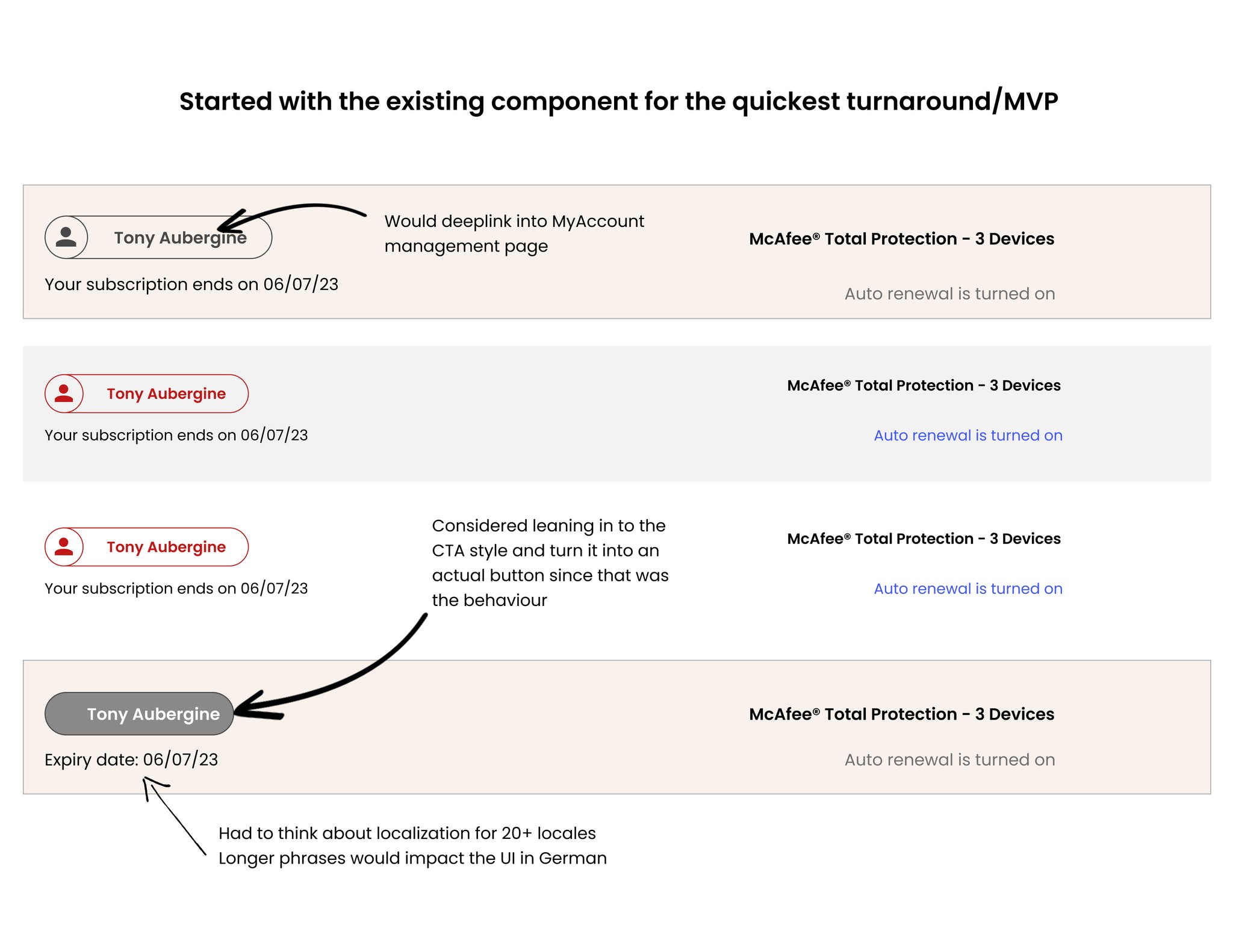

Design Iteration
Design Iteration
What Worked, What Didn't
What Worked, What Didn't
Slowly Updating Components To
Match The Brand
Slowly Updating Components To
Match The Brand
Not only did the project allow for improving the user experience, it also meant changes could be made to bring the Support website to align with the brand's design system and main website.
Not only did the project allow for improving the user experience, it also meant changes could be made to bring the Support website to align with the brand's design system and main website.
Mobile Container Obstacles
Mobile Container Obstacles
The Business was clear on showing as much context as possible 'above-the-fold'.
With the way the old website was structured, a lot of real-estate was already occupied
The links had to be positioned so as to not overlap with the feedback button
The Business was clear on showing as much context as possible 'above-the-fold'.
With the way the old website was structured, a lot of real-estate was already occupied
The links had to be positioned so as to not overlap with the feedback button
Final Solution
Final Solution
The Solution: Turning a Simple Fix into a Strategic Feature
The Solution: Turning a Simple Fix into a Strategic Feature
Deeplinking the Banner
Deeplinking the Banner
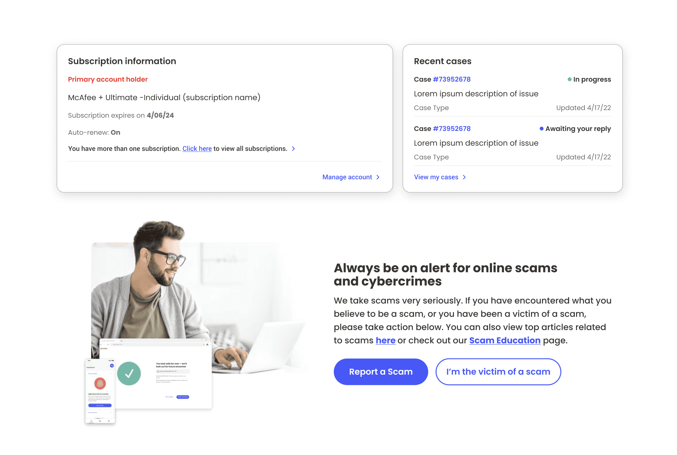
Clicking on 'view all subscriptions' or 'manage account' would deep-link directly to their subscription details.
Clicking on 'view all subscriptions' or 'manage account' would deep-link directly to their subscription details.
Showing Active Subscription Details
Showing Active Subscription Details
Instead of info they couldn't action on, users would now immediately see:
Their active subscription(s)
The expiration date
A direct link to manage their subscription
Instead of info they couldn't action on, users would now immediately see:
Their active subscription(s)
The expiration date
A direct link to manage their subscription
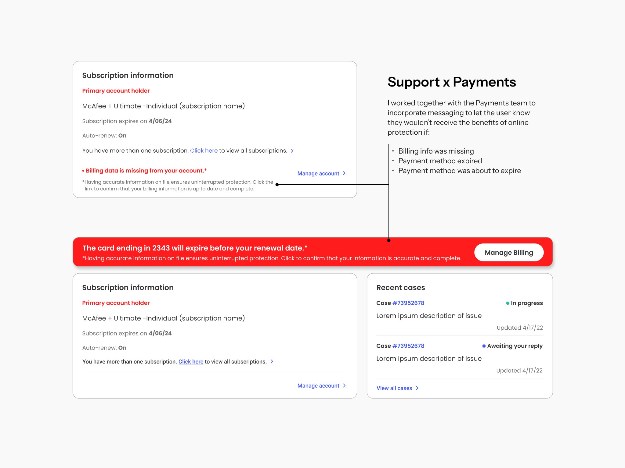
Preventing Duplicate Subscription Confusion*
Preventing Duplicate Subscription Confusion*
I pushed for explicit messaging to show if they had multiple subscriptions, so they knew why they were receiving multiple emails.
I pushed for explicit messaging to show if they had multiple subscriptions, so they knew why they were receiving multiple emails.
*This received pushback from the business for the first iteration.
*This received pushback from the business for the first iteration.
2024 Update
When the new website CRM was launched it became a requirement and today we let our users know if they need to manage multiple subscriptions.
Engineering handoff
Engineering handoff
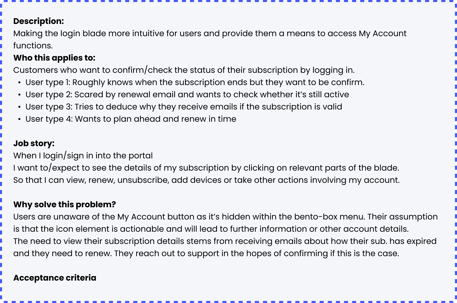
I proposed a User Stories framework to help the Dev team understand why we were implementing this change.
This led to a sense of ownership and a new way of writing JIRA tickets at McAfee.
I proposed a User Stories framework to help the Dev team understand why we were implementing this change.
This led to a sense of ownership and a new way of writing JIRA tickets at McAfee.


Results
Results
Outcomes
Outcomes
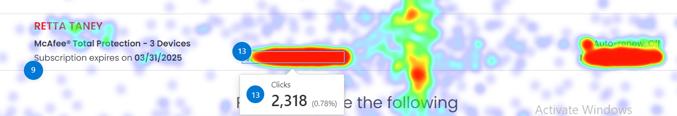
Click heatmap timeframe: 1 month
Captured thousands of redirected clicks
Now that we had explicitly called out a 'manage subscription' link, users no longer had to rage click their way to answers.
+13 rank jump from launch
Outperforming 85%+ of page elements instantly.
It was a clear indication that users had been looking for this information and now they had it.
~3 minutes saved per call
We saved roughly 3 minutes per subscription-related call since users were now armed with information to get to the heart of the issue.
Giving users more agency
Giving users more agency
By making subscription status immediately visible, we reduced the need for customers to contact support just to verify their renewal date.
By making subscription status immediately visible, we reduced the need for customers to contact support just to verify their renewal date.
2024 SalesForce component
2024 SalesForce component
From a simple banner on the homepage, it evolved into a core need for the business when they partnered with SalesForce to build a new website.
From a simple banner on the homepage, it evolved into a core need for the business when they partnered with SalesForce to build a new website.
2024 Collaborating with the Payments Team
2024 Collaborating with the Payments Team

What I'd do differently if I were to repeat the project
What I'd do differently if I were to repeat the project
Looking back I enjoyed this project since I got to bring my insights to the table and advocate for the user.
Looking back I enjoyed this project since I got to bring my insights to the table and advocate for the user.
Advocate for more space
Advocate for more space
I would pushback the requirement from stakeholders to keep the banner height as is. As we can see from the 2024 update, this criteria eventually evolved to allow for more information.
I would pushback the requirement from stakeholders to keep the banner height as is. As we can see from the 2024 update, this criteria eventually evolved to allow for more information.
I would use AI to provide more granular insight.
I would use AI to provide more granular insight.
Next project
Open to opportunities!
nashok.design@gmail.com
Good Design Empowers Everyone.

Reach out for kuchen mit conversation
Reach out for kuchen mit conversation
Reach out for kuchen mit conversation