UX Design
UI Redesign +
Achieving
WCAG 2.0
Improving accessibility and readibility
of Knowledge Articles
The problem:
Users were dissatisfied with overall readability and the business wanted to maintain brand consistency
The solution:
On the surface, this was a simple UI redesign.
However, it was made complex due to several accessibility issues and legacy code
The challenge:
Addressing the accessibility issues alone took several sprints.
Initial assessment
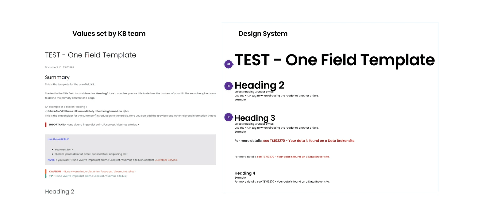
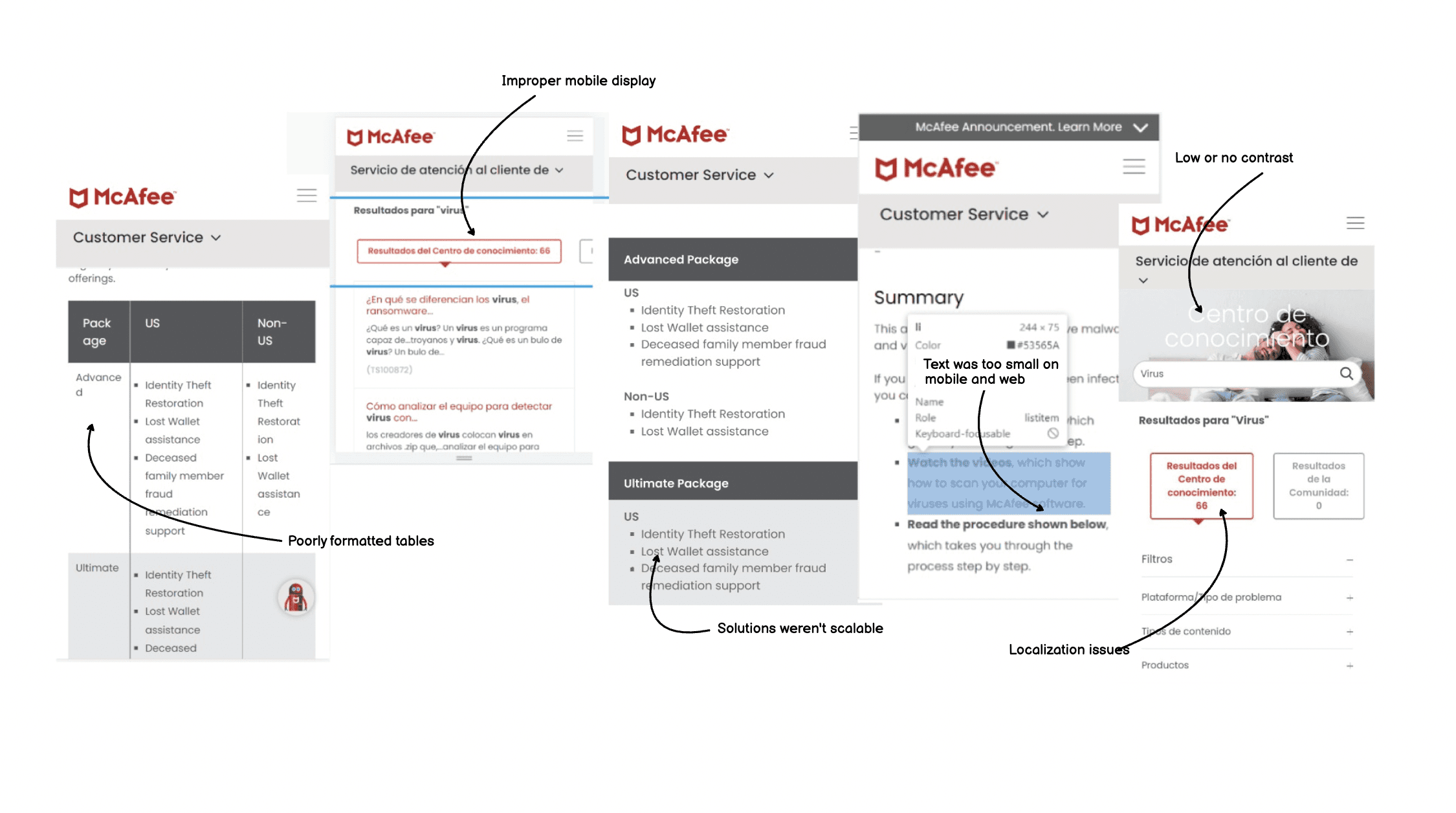
UI inconsistencies
branding, visual heirarchy, layout, line heights etc
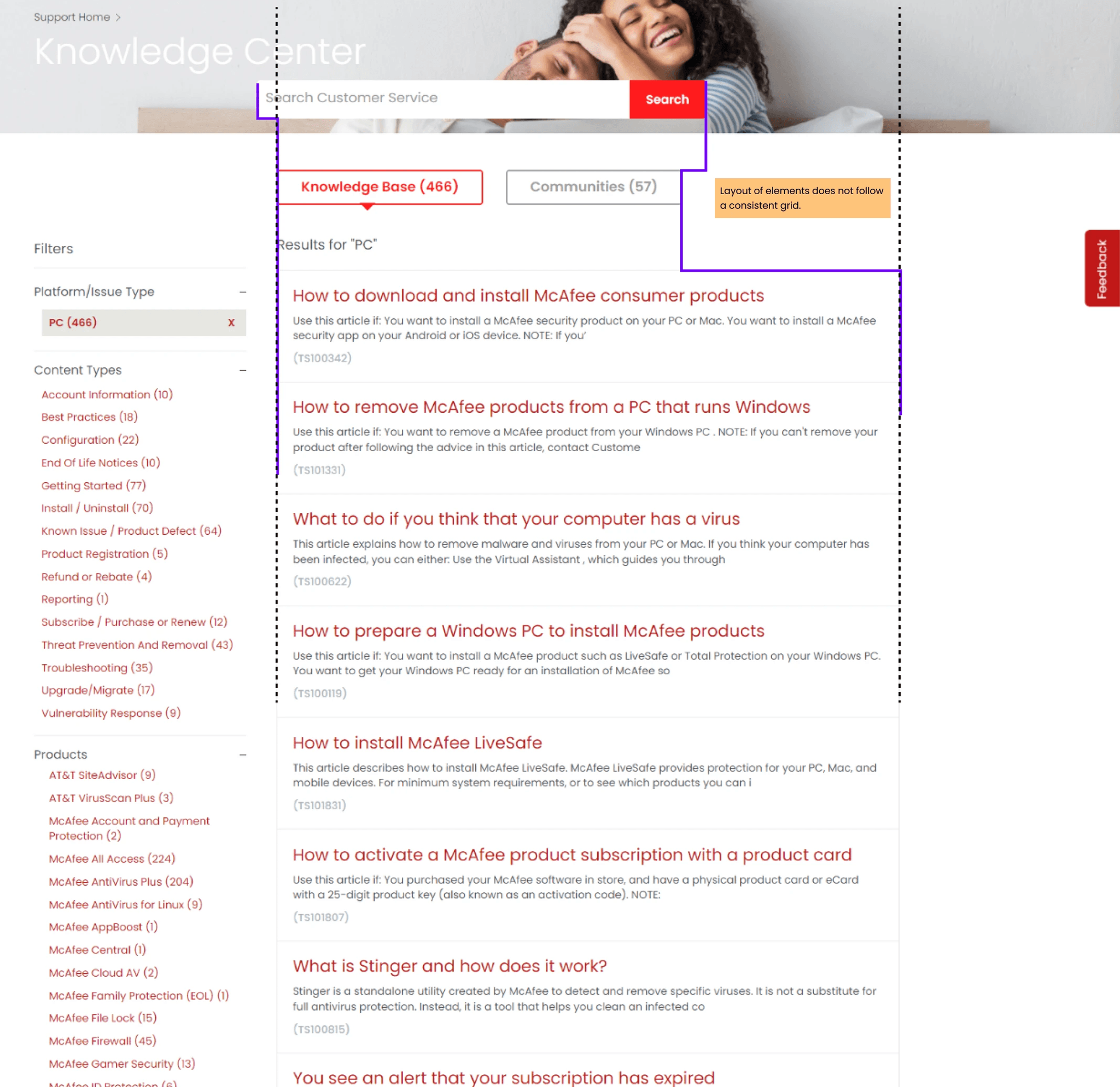
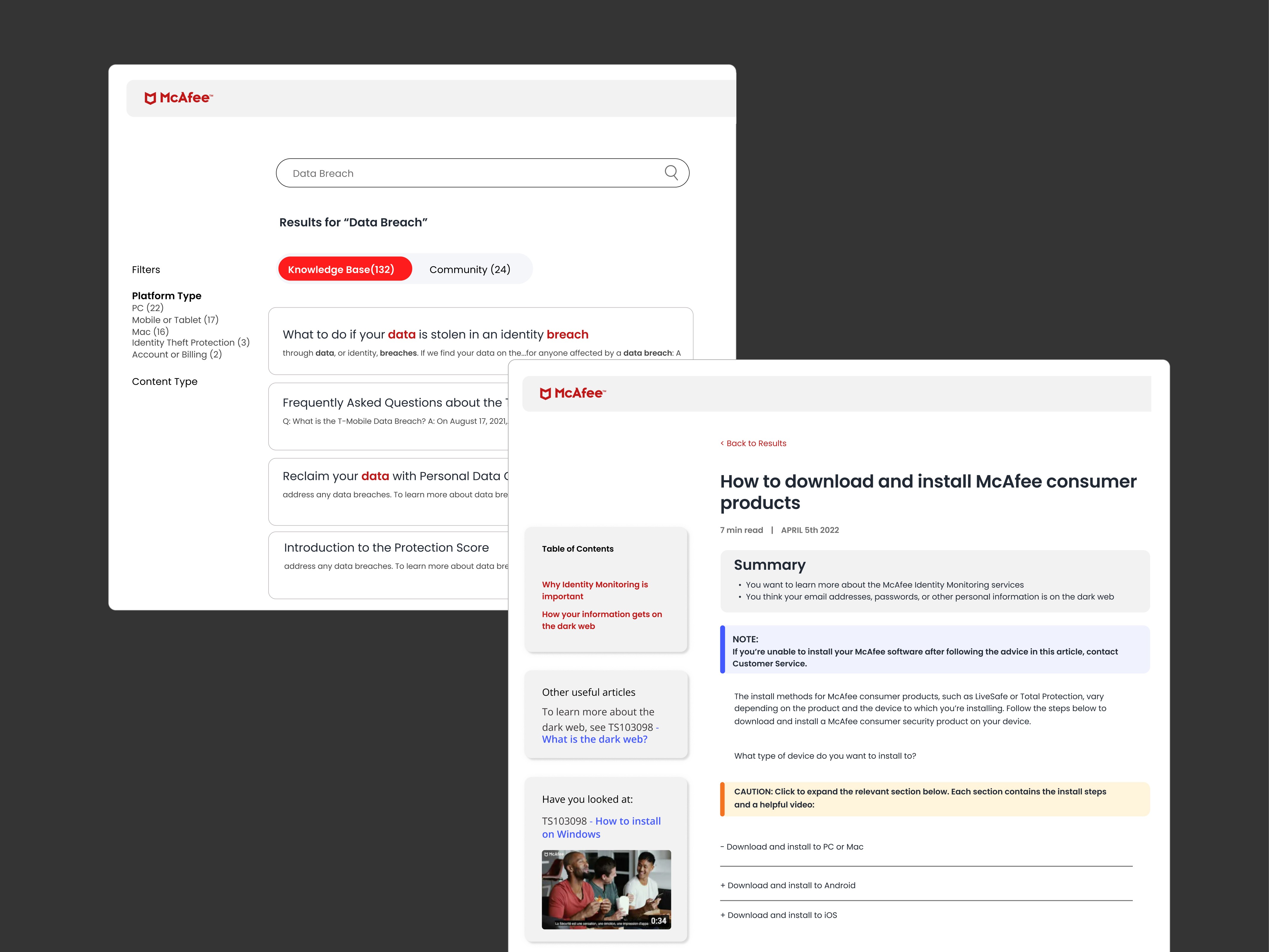
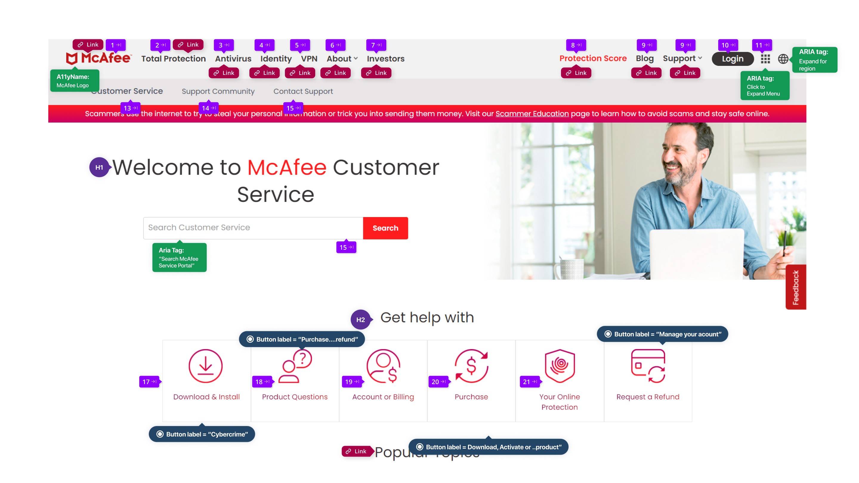
The site in 2022
Initial research
I looked at articles, blogs and content across our platforms (product, main website, support, community etc).
I accessed PowerBI where I had the latest year's worth of customer feedback to look at.
I then interviewed the main stakeholder to understand how/why the articles are formatted currently and the challenges they faced.
Observations/Takeaways
Years of design debt
.
The current UI + components weren't up-to-date with brand guidelines.
Custom coded components manually added in
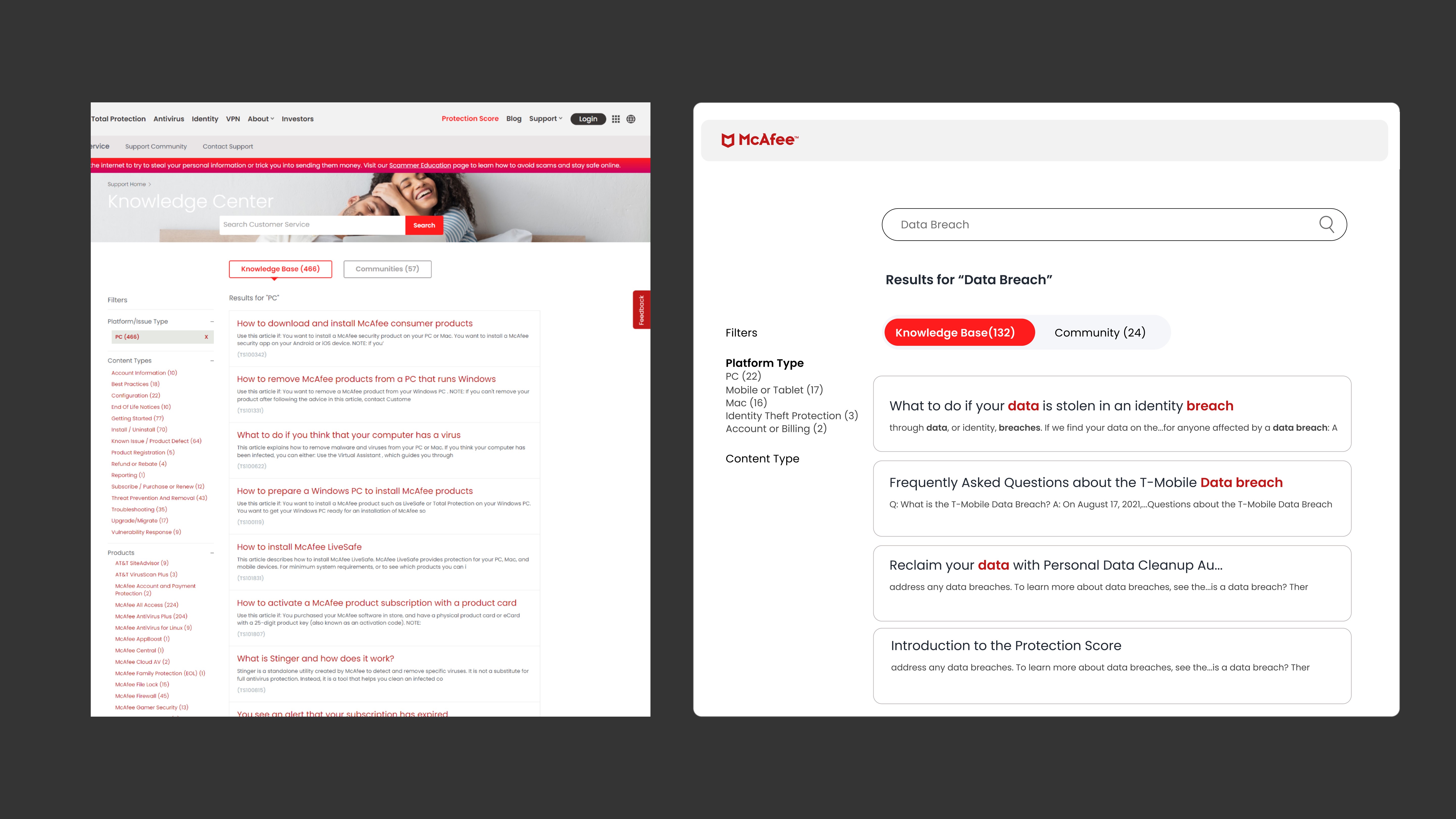
Easier way to show relevant content?
The articles were long because they covered multiple scenarios under a topic. This made it hard to read and it was up to the user to find the right info
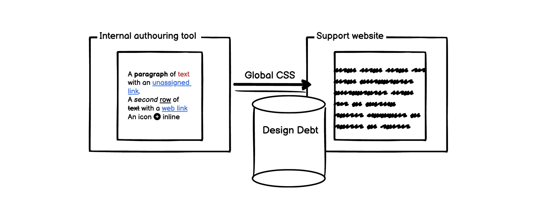
Internal tool vs Front-end
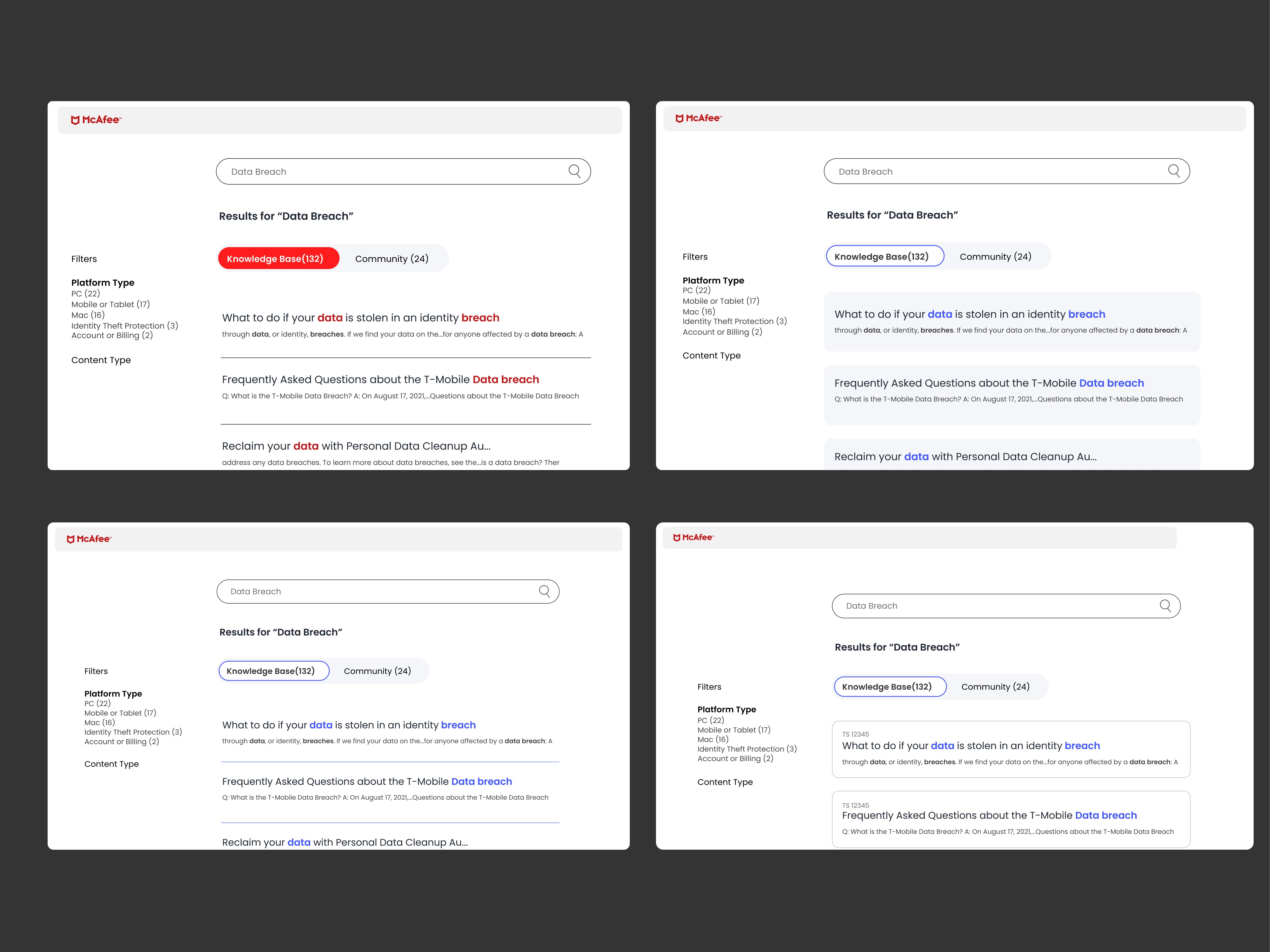
Although the KB team formatted the article properly the global CSS would overwrite their code.
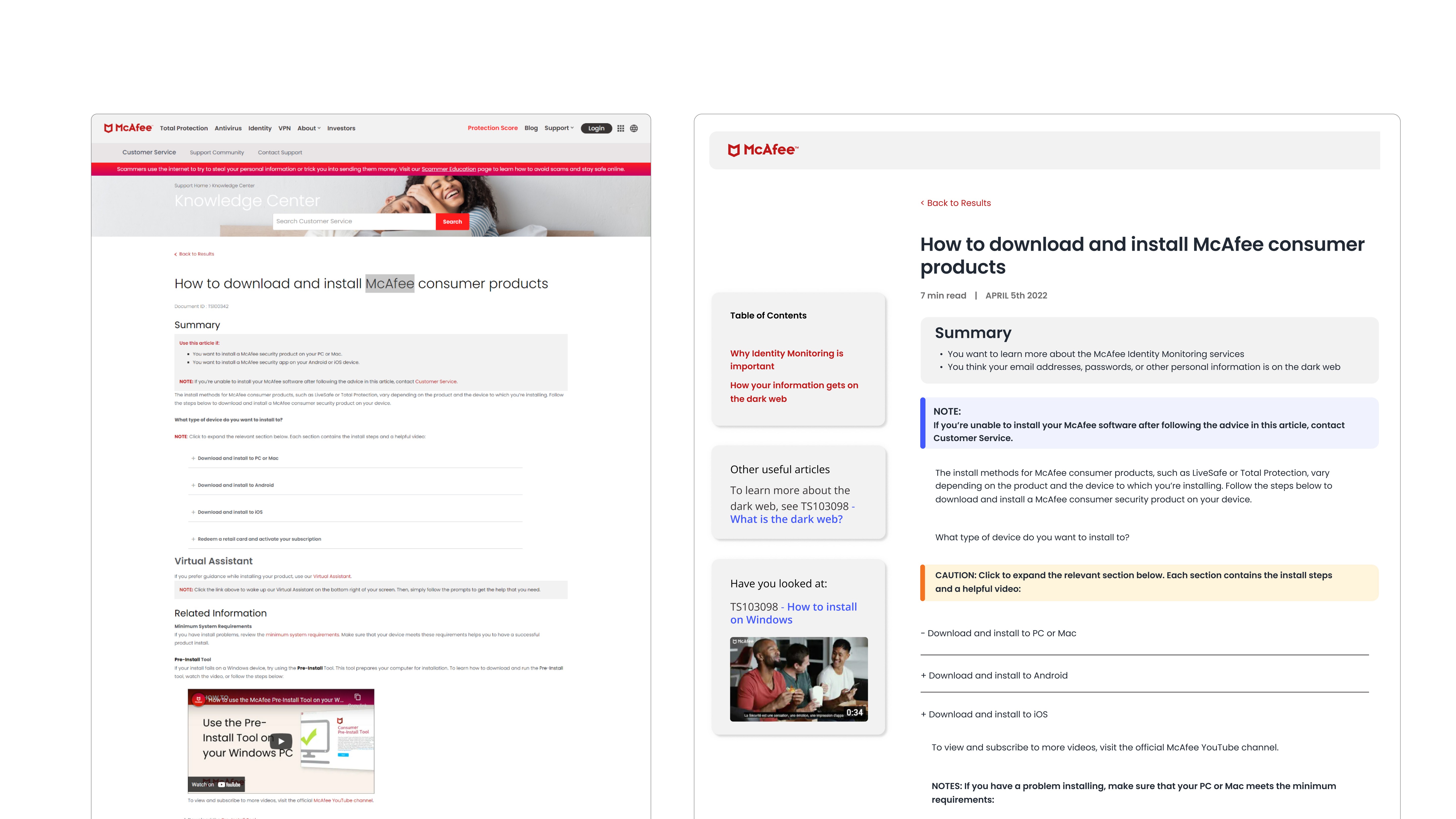
The KB site in 2022
Design from 2022, currently being built
New priority
WCAG 2.0
Accessibility improvements take precedence
The challenge:
Limited Dev resources and time meant we had to move UI changes to the backlog and take up Accessibility fixes.
The solution:
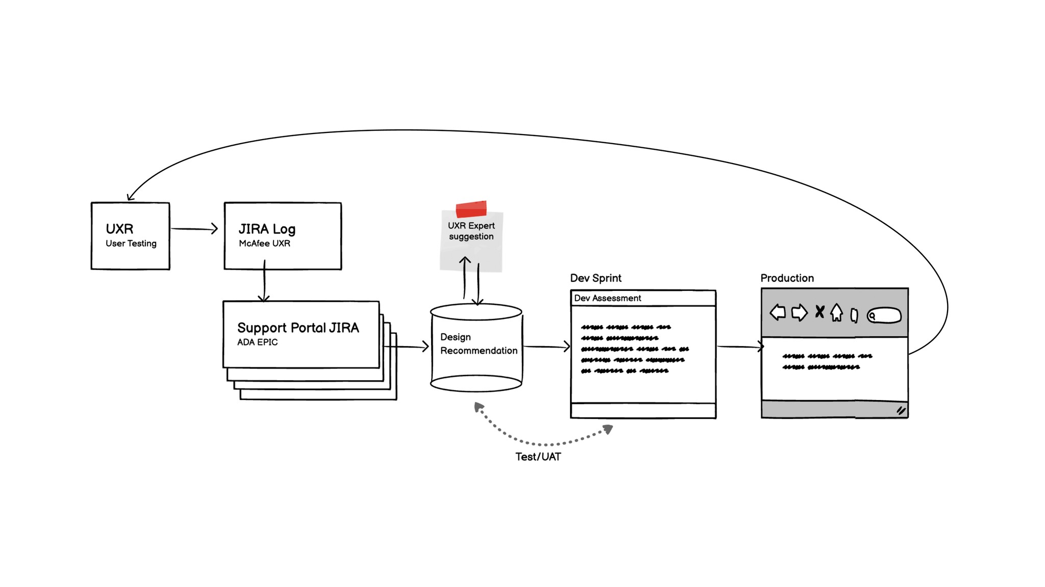
We worked with UXR who identified issues and we split them across our sprints.
I took on the role of accessibility SME within customer support.
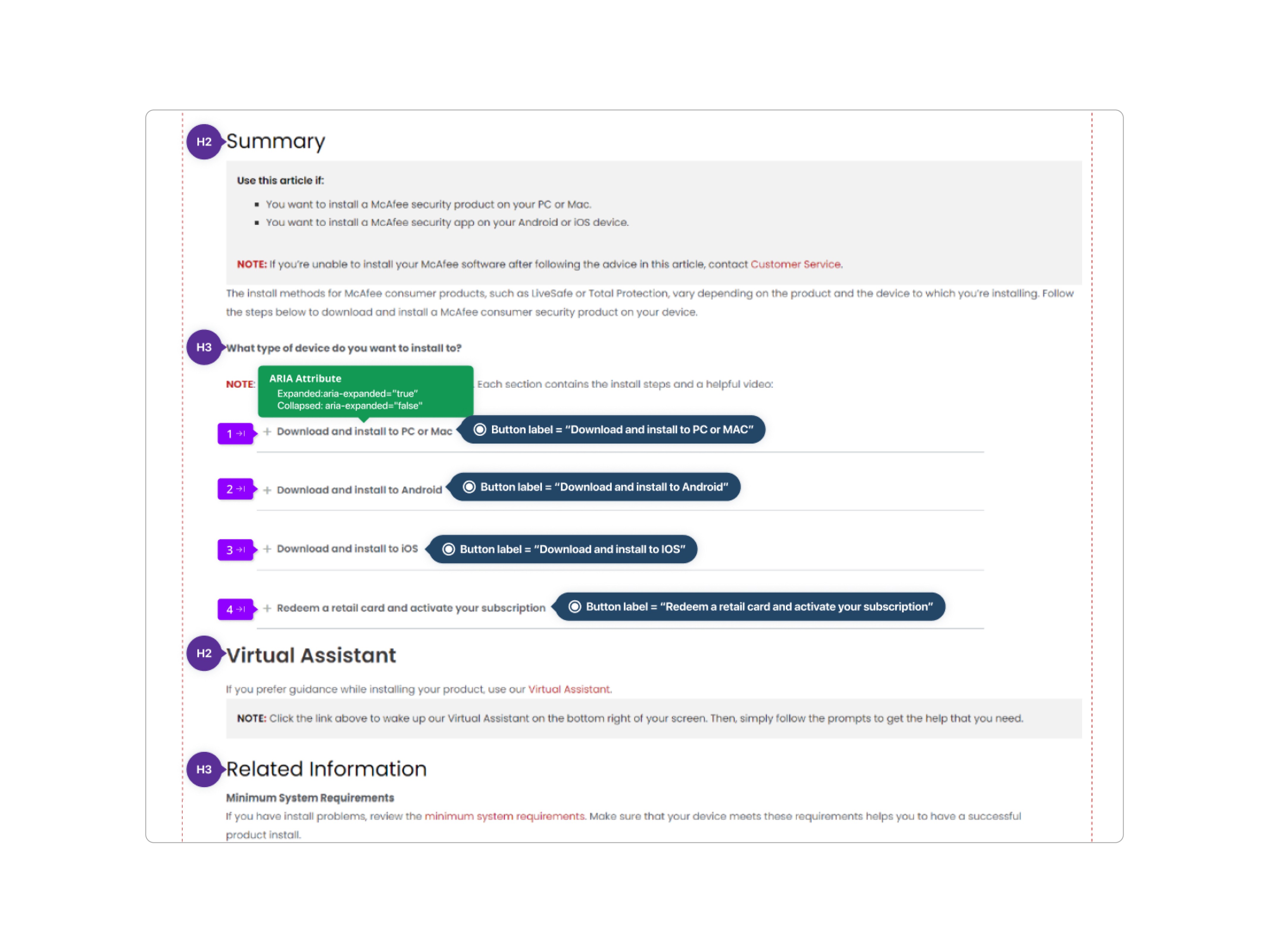
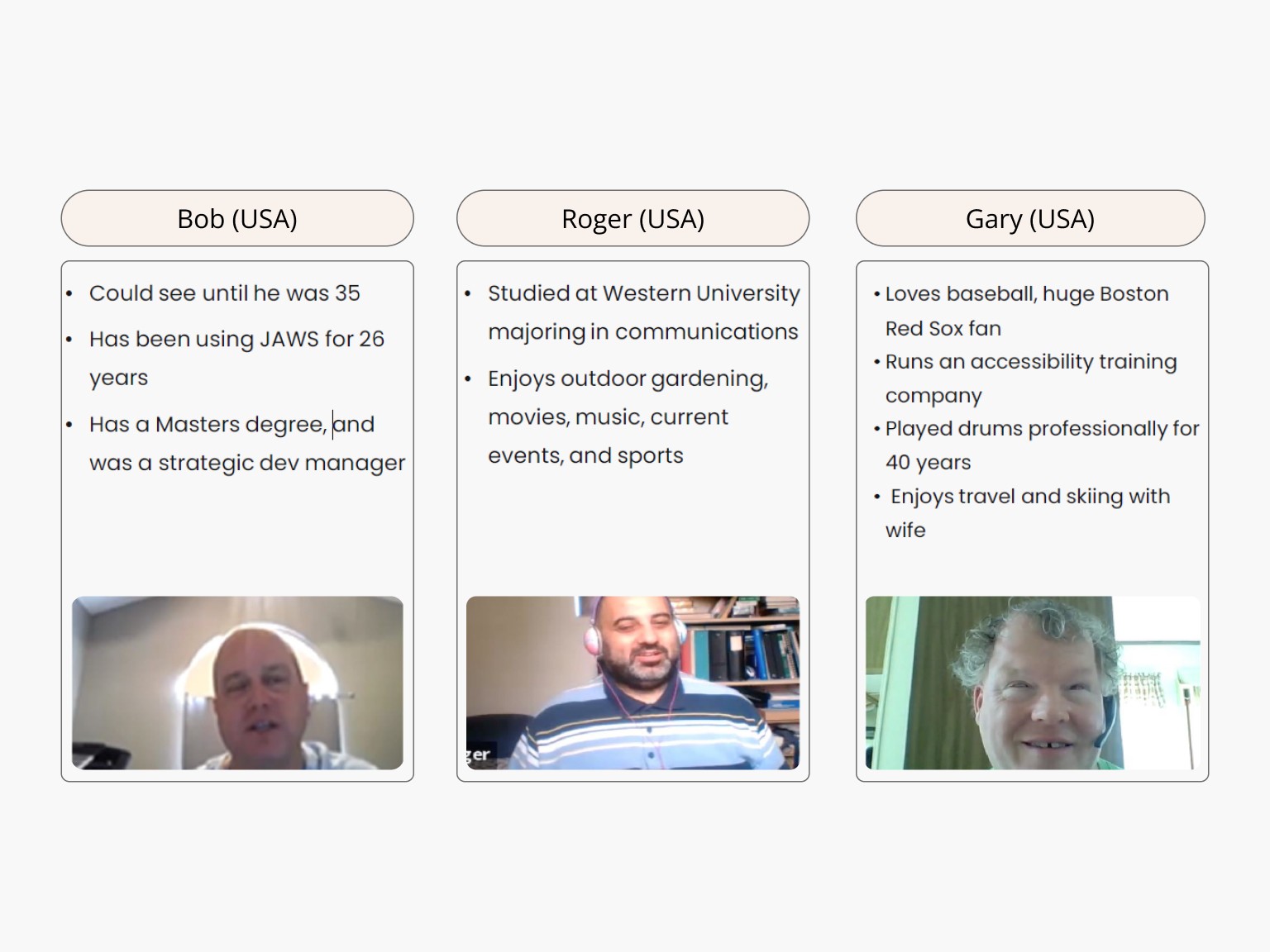
JAWS/NVDA User Testing + Outcomes
23+ JIRA stories | 7+ Months
The current UI + components weren't up-to-date with brand guidelines.
Custom coded components manually added in
4 Check-ins to assess progress
We had to make quarterly ADA improvements and achieve WCAG 2.0
by year-end.
8 FABLE users + session recordings
We worked with visually impaired users who would provide feedback on what wasn't working. I was able to joining the last set of these sessions and invited my Dev team to sit it too.
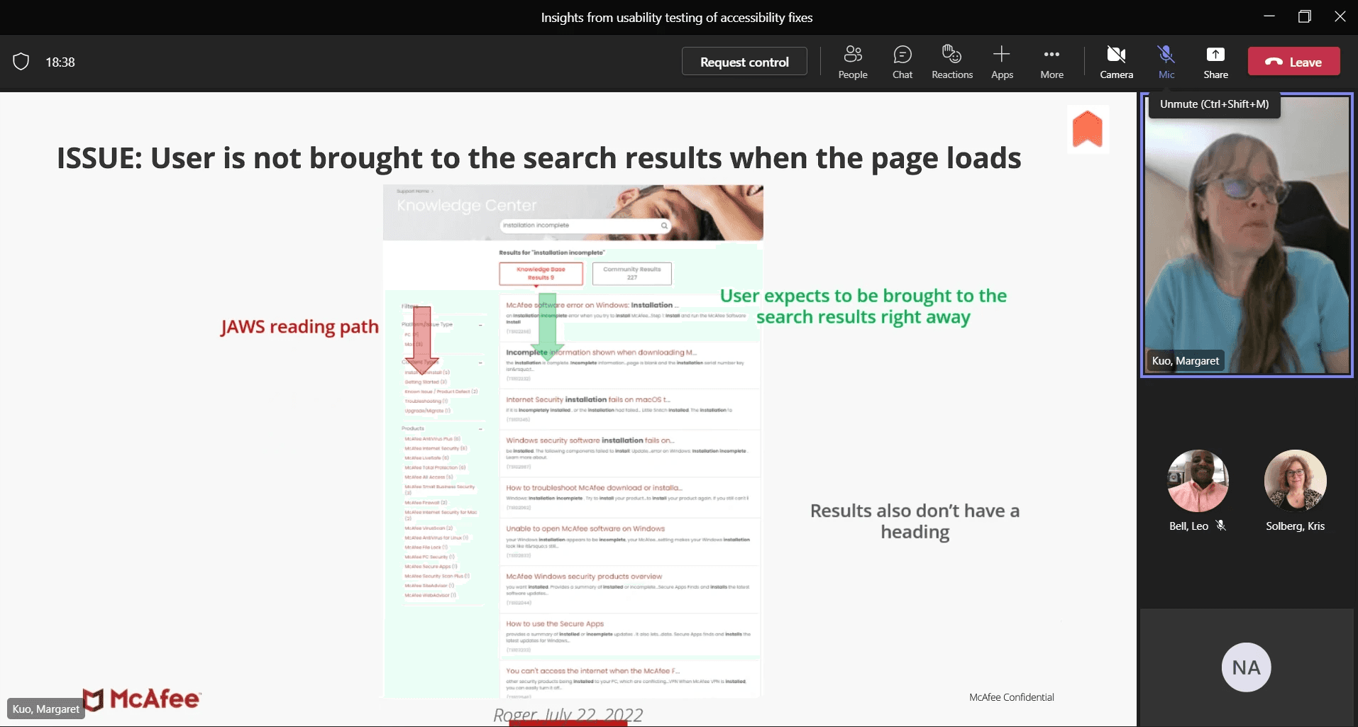
Margaret Kuo walking us through observed behavior.
Certain issues took months to rectify
We missed UAT cases or new errors cropped up.
Some went through all 3 rounds of testing before being deemed usable. Like the chatbot, contact support flow and nested FAQs.
Some were easy fixes like test contrast, font size, DOM order.
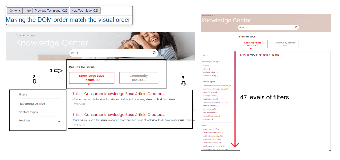
Tab order followed the code DOM structure. A decision was made to skip the filter entirely.
The project was a crash course in WCAG 2.0 principles.
It was great collaborating with JAWs users and a revelatory experience as a designer.

Conclusion
Lessons Learned
Lessons learned:
CSAT scores aren't always a reliable indicator of quality
90% of our users left no feedback. The articles had a deflection rate of 80%. A small subset of detractors left -ve reviews.
Workshop outcomes depend on the group invited
A workshop I conducted to gather ideas from different SMEs (outside KB) meant I was talking with people who didn't have in-depth knowledge of the problem.
Accessibility should be baked in from the start
It is harder to retroactively make ADA compliant product/website fixes.
We kept this in mind while designing future pages/components
It was great collaborating with JAWs users and a
revelatory experience as a designer.
This project helped me establish a great rapport with Devs
The back-and-forth and daily conversations helped me grow as a designer and helped share the knowledge with the rest of the team.
Conclusion
What I would do differently
What I would do differently now:
Pitch UI improvements better
Outling impact before submitting a project request so it doesn't fall under 'cosmetic changes'
Call for simpler solutions to unsalvageable code
The contact support flow was ultimately too flawed to be improved by a significant margin.
Next project