
Ethnographic Research
Prototyping

Context

Experienced agents each had unique methods of organising information
Insight - Agents were finding workarounds to poor processes
A Word doc with every relevant link organised by subject

Sticky notes with price points and shortcuts to commonly asked questions

Taping a pricing chart to the wall
Real Insight Came From Watching New Agents Struggle
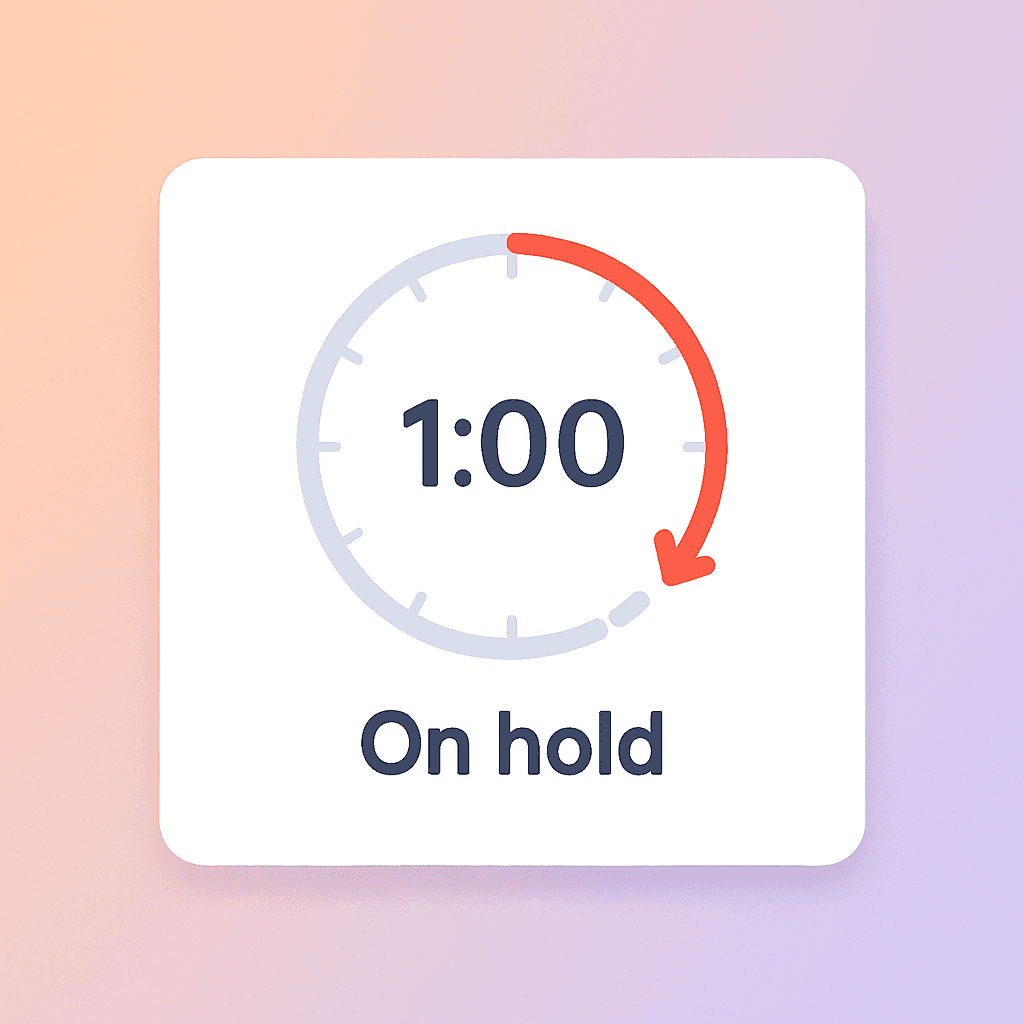
New agents set a timer for 1 minute and placed the caller on hold while they searched for answers.
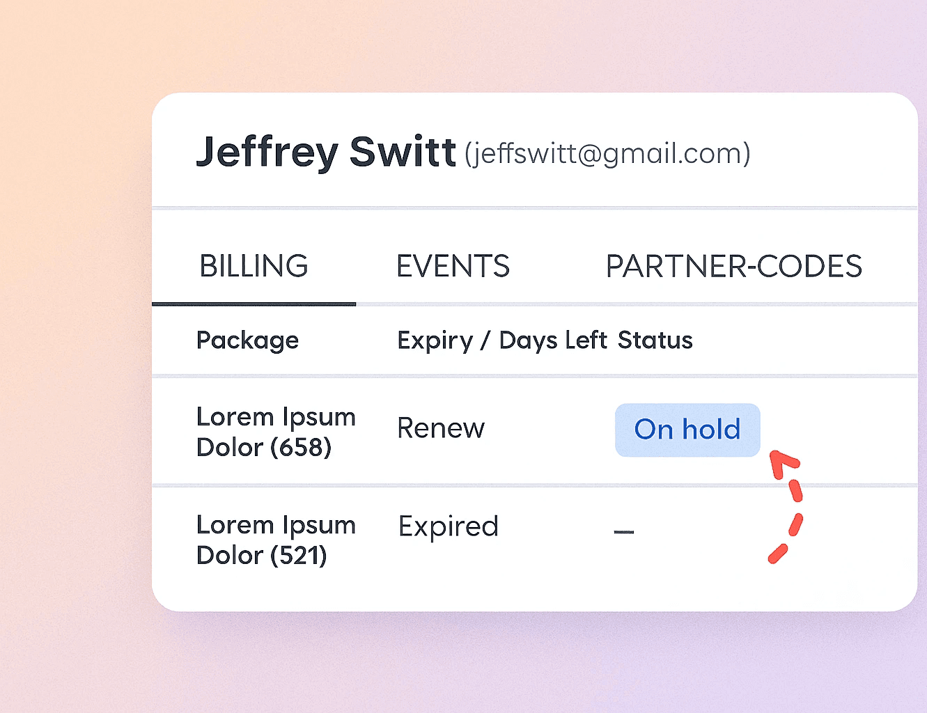
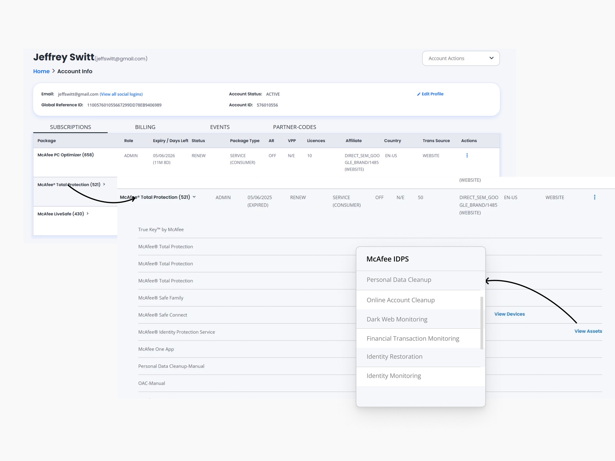
Agent looks up SKU inside of tool
Agent places the customer on hold
A given topic could have 6-9 articles
1 min. Eternity for the customer. Not enough time for an agent.
Insights
Content needed consolidation
I observed agents jumping between multiple open tabs because articles were written by multiple authors over months/years.
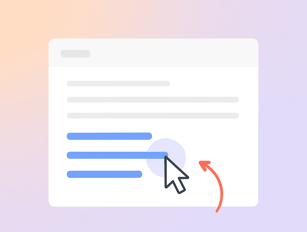
Quicker access to answers in the tool
The tool only showed them what SKU the customer was on.
No brief on features
No link to relevant article
Marketing jargon
Customers didn't care that the software would handle 1 million threats. They wanted to know how it would impact them.
Missing visuals and no simulators
With frequently changing UI and no simulation tool, agents had to guess what the customers were seeing.
Senior Agents Had Hacks. Juniors Had Gaps.
This contrast revealed a deeper issue: Knowledge wasn’t organised.
Agents were building their own systems because ours weren’t working.
If we wanted consistency and faster support, the fix couldn’t be more tabs or tools. It had to be built into the flow.
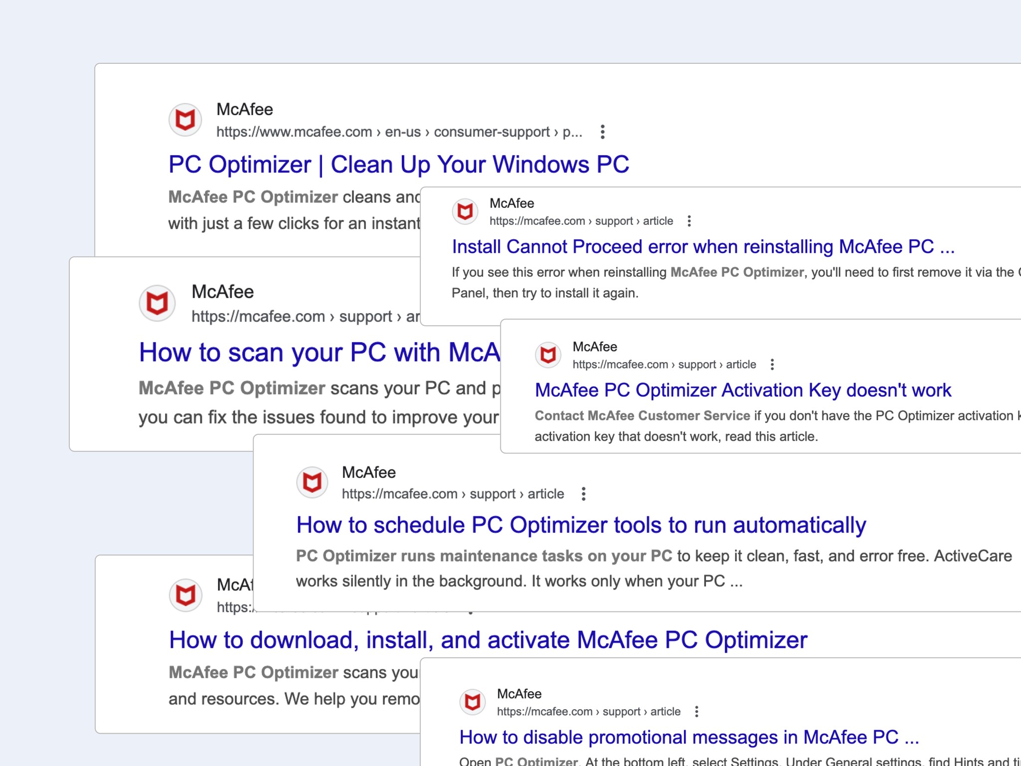
Every feature/topic had mutliple articles associated with it
What they currently trained with:
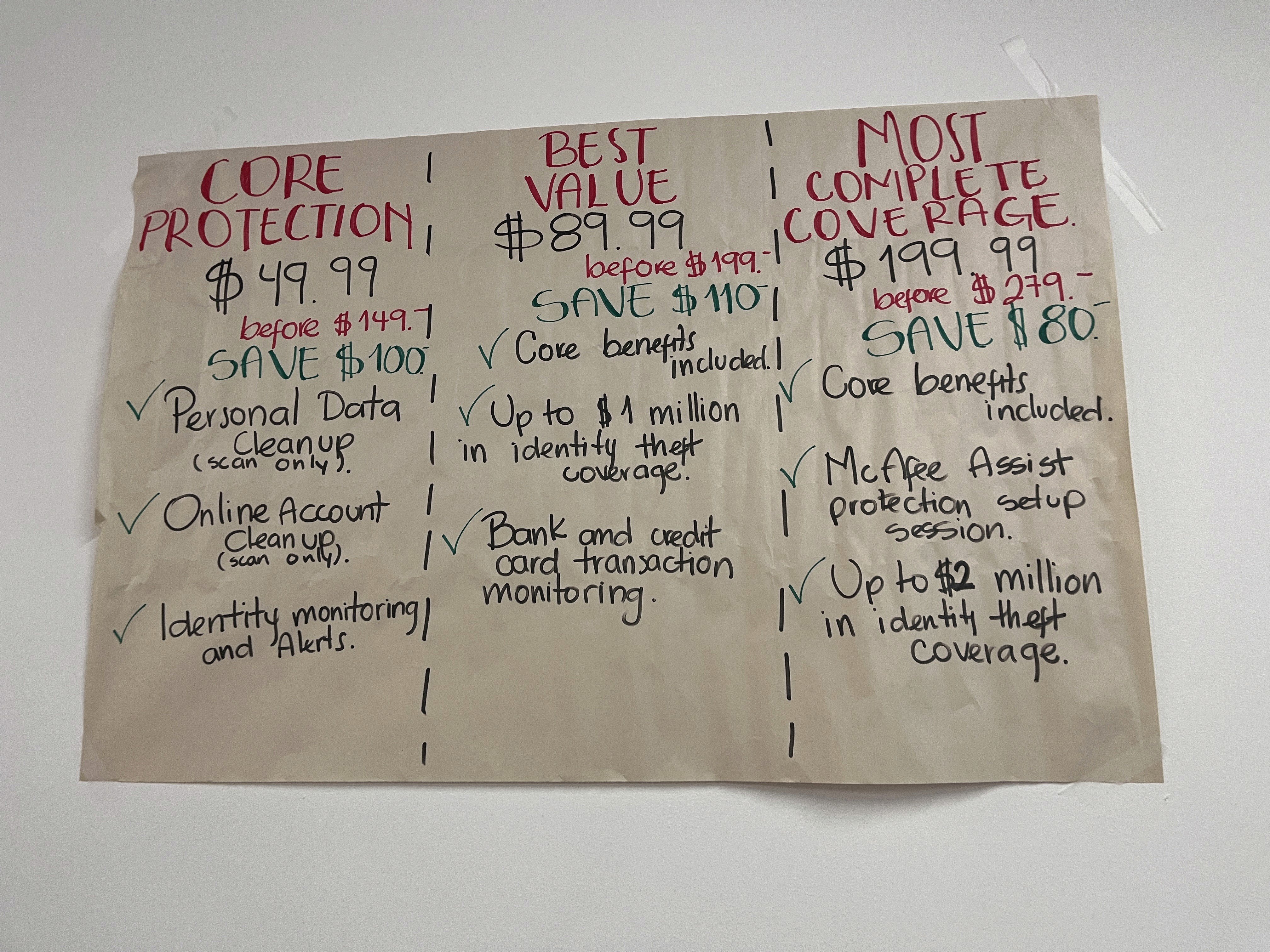
Handwritten posters
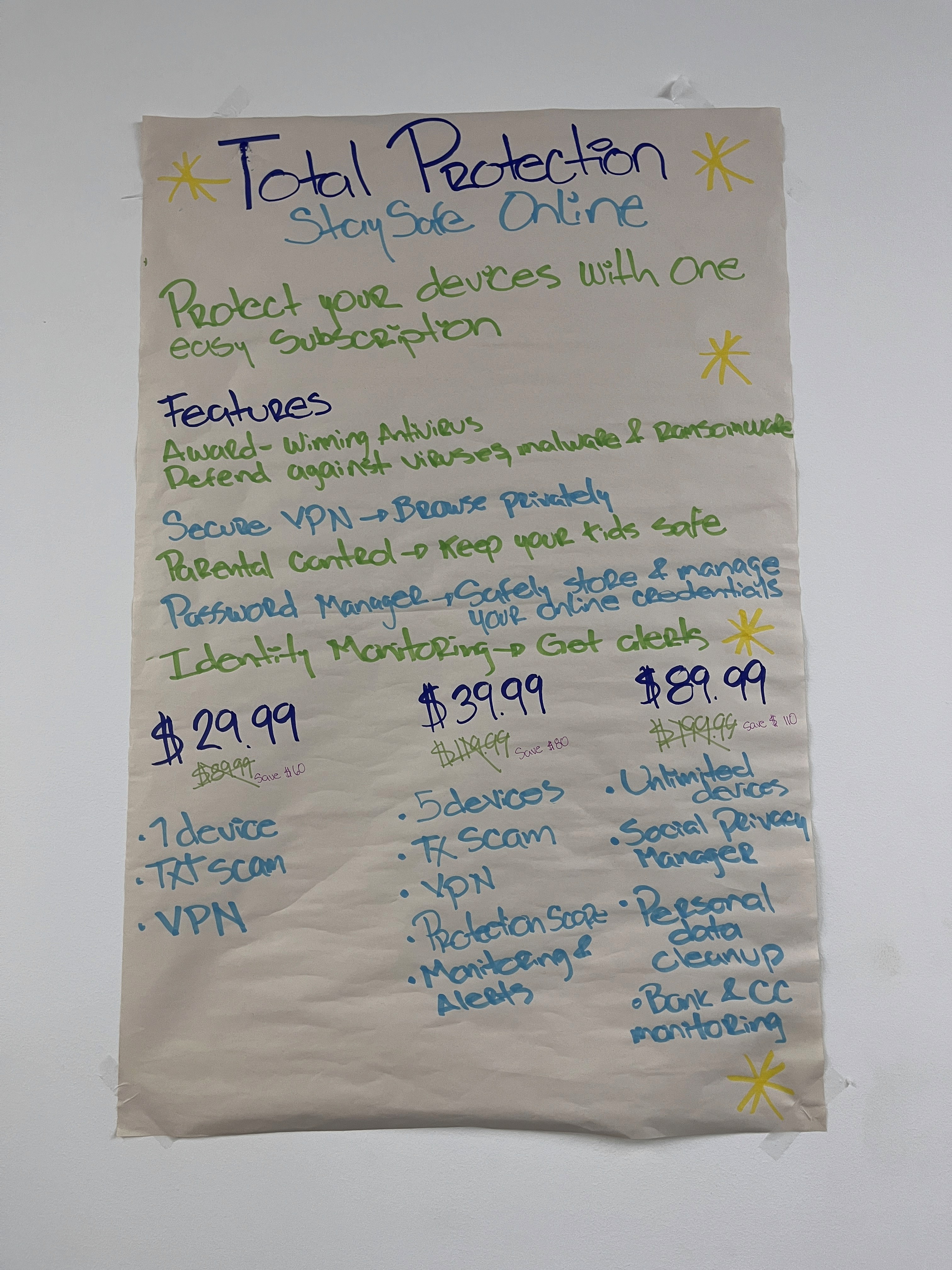
A cheatsheet - to print + digital
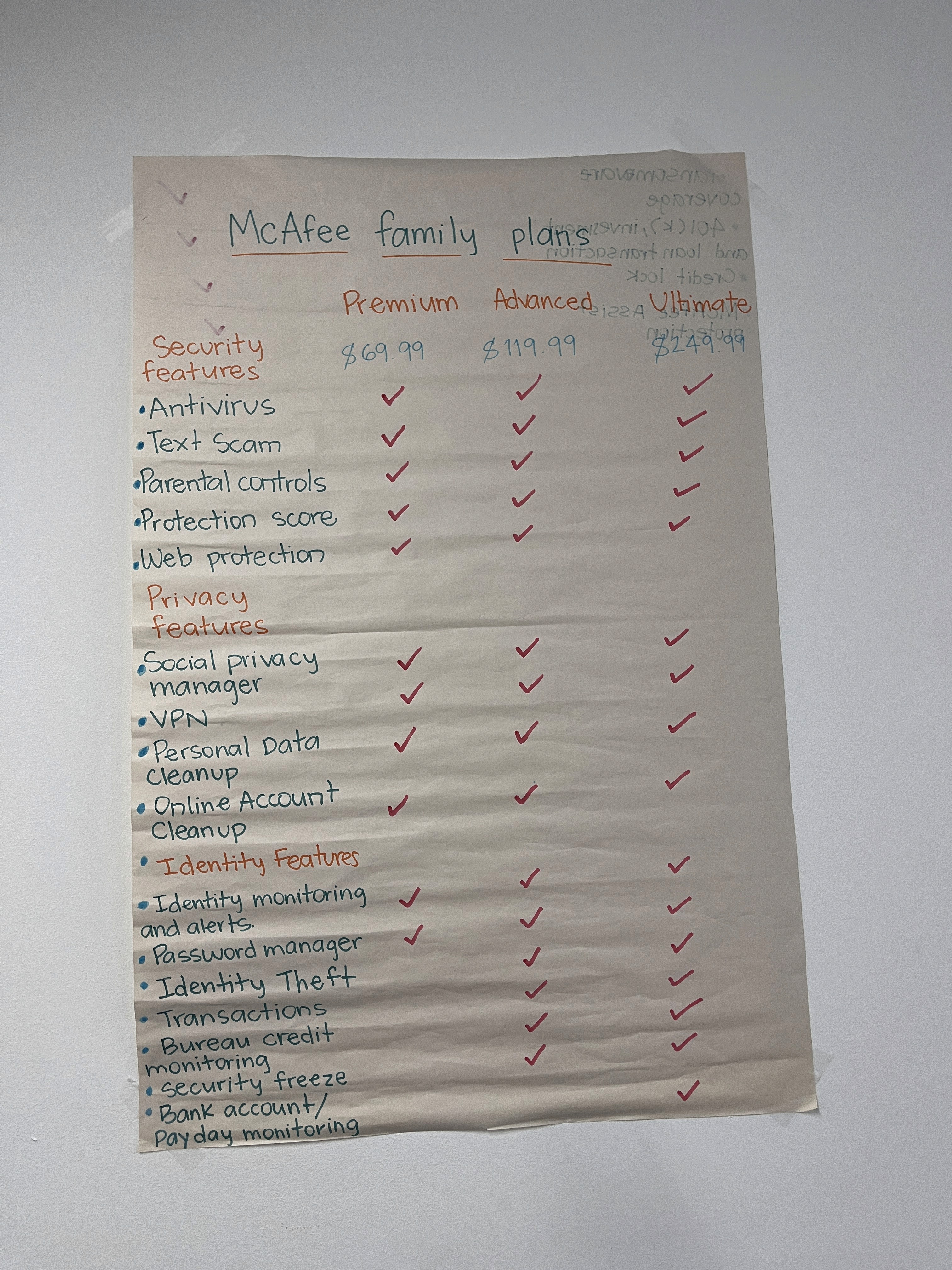
FAQ style prep sheet
Final Solution
Instead of creating yet another resource (like a flashcard) for the agent to handle, I saw an opportunity within the tool itself.
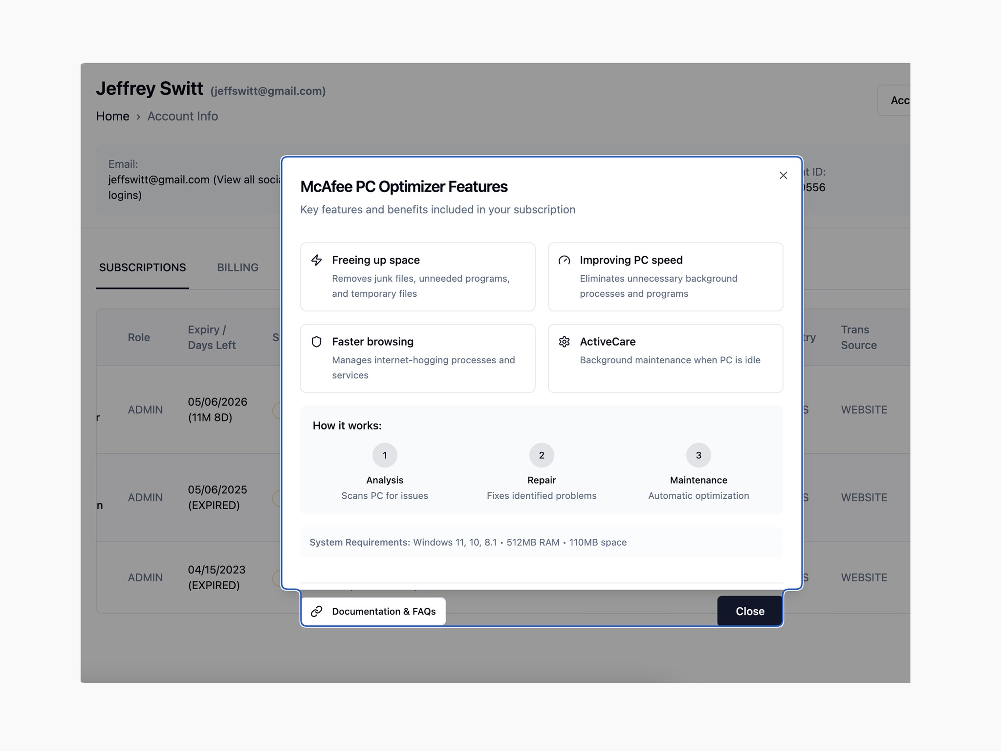
What could the pop-up modal look like?
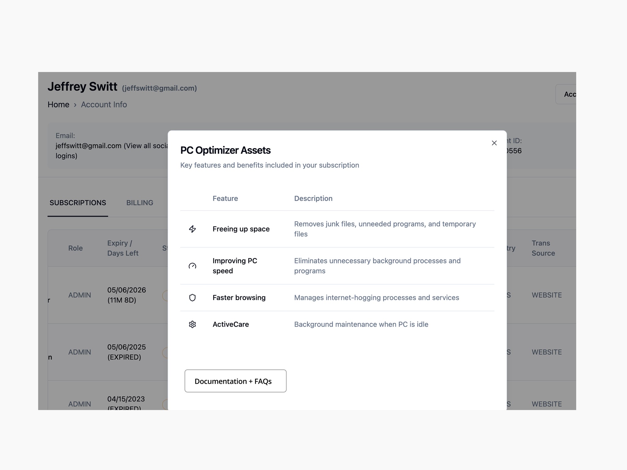
Ultimately the easiest means for Engg to implement the change was a stripped down version
I proposed embedding feature summaries directly within the internal tool’s "View Assets" section.
Each product feature now:
Explained what it does, in human terms
Linked to the most relevant (and updated) KB article
Reduced the need to switch tabs or guess
A small change, but a significant impact.

While the proposed changes could be a quick win, the internal tool required Dev resources
