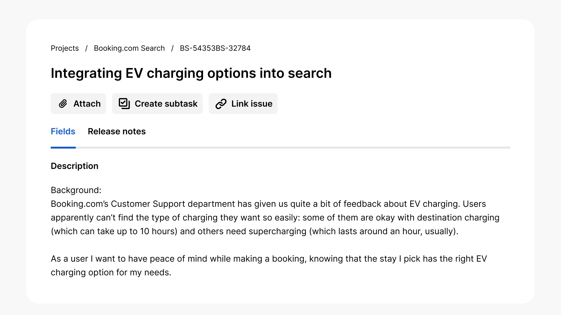
Improving the usability of the Knowledge Base
Improving the look and feel of the Knowledge Base by updating the UI and following best practices for article design.
Mcafee.com
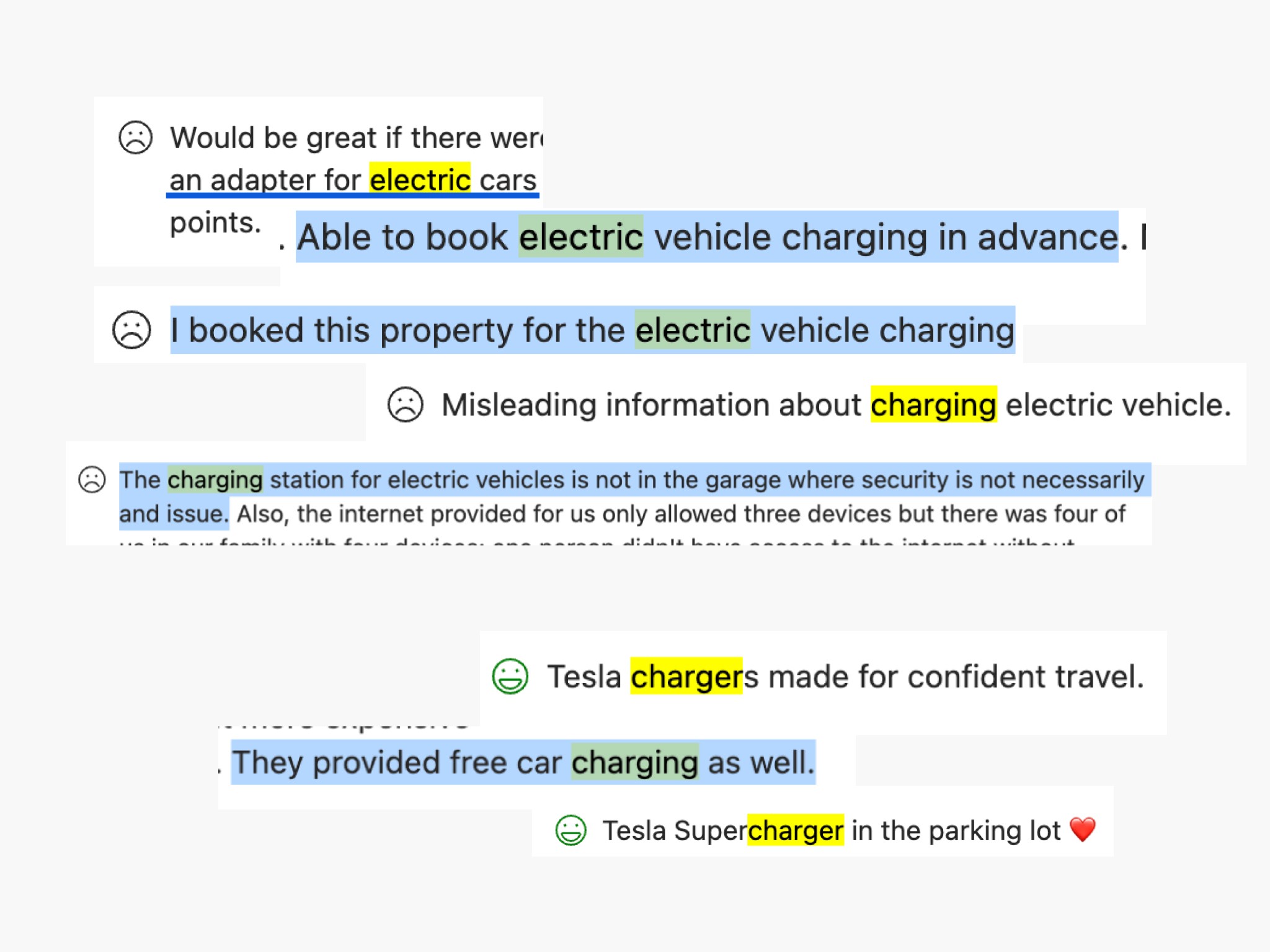
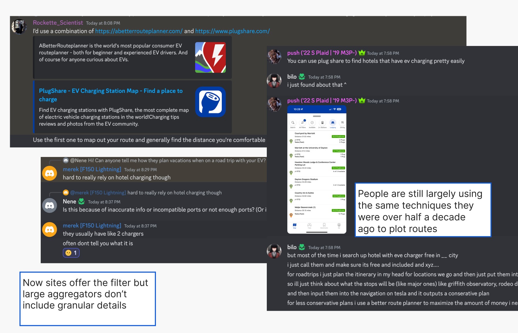
User Research
Competitive Audit
Prototype Testing
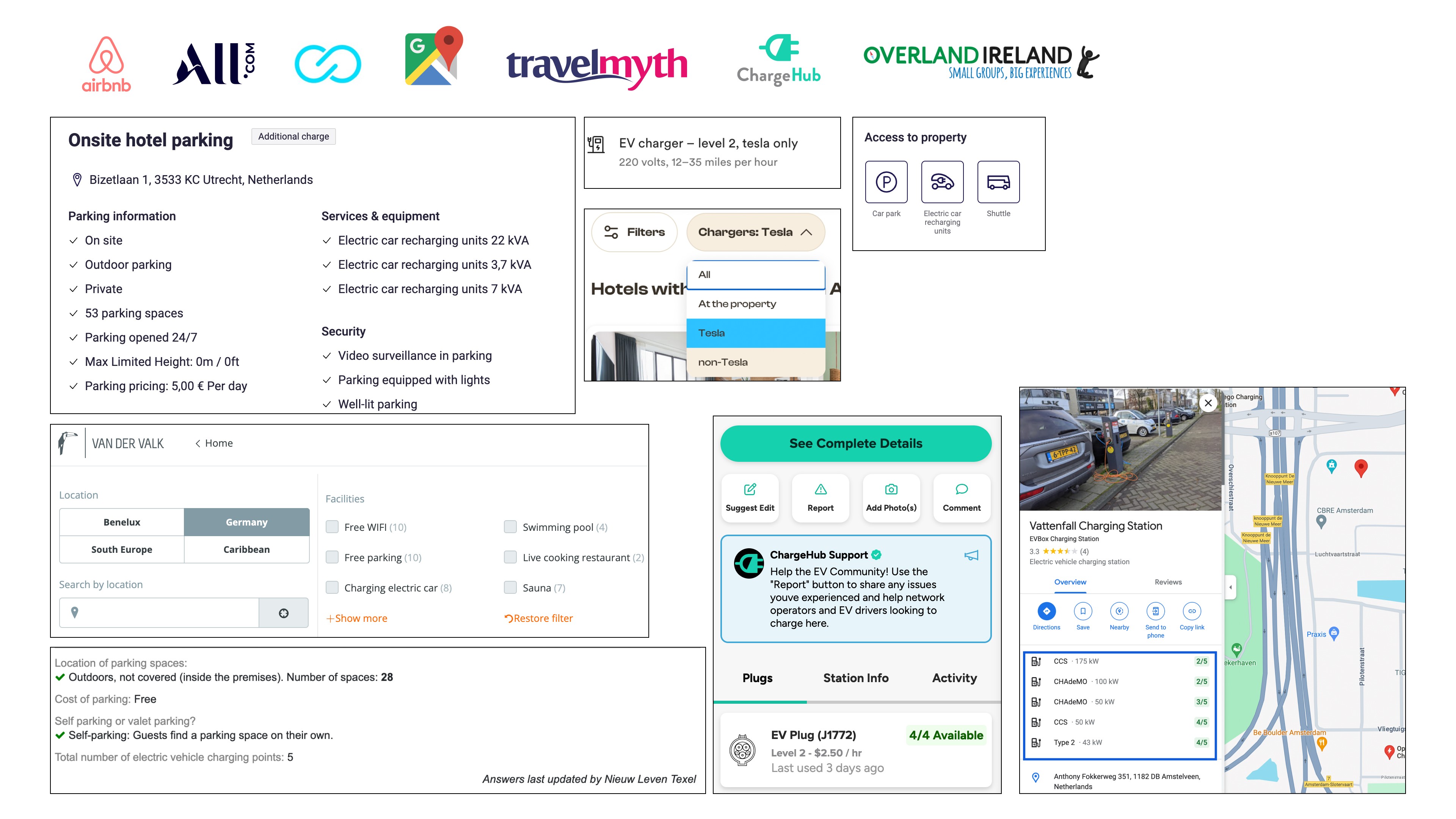

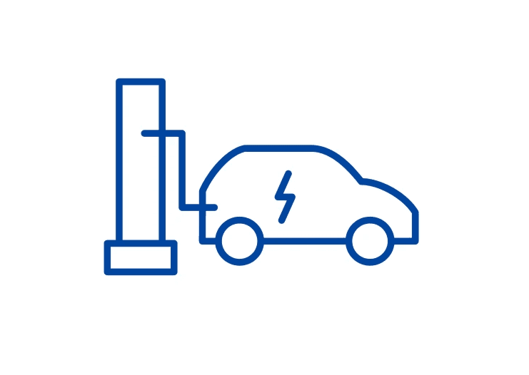
Business travelers
Users who might not be able to select their car in advance and are stuck when arriving at a hotel not equipped with them.
Renters
Typically users in the EU who would drive to another country for holiday.
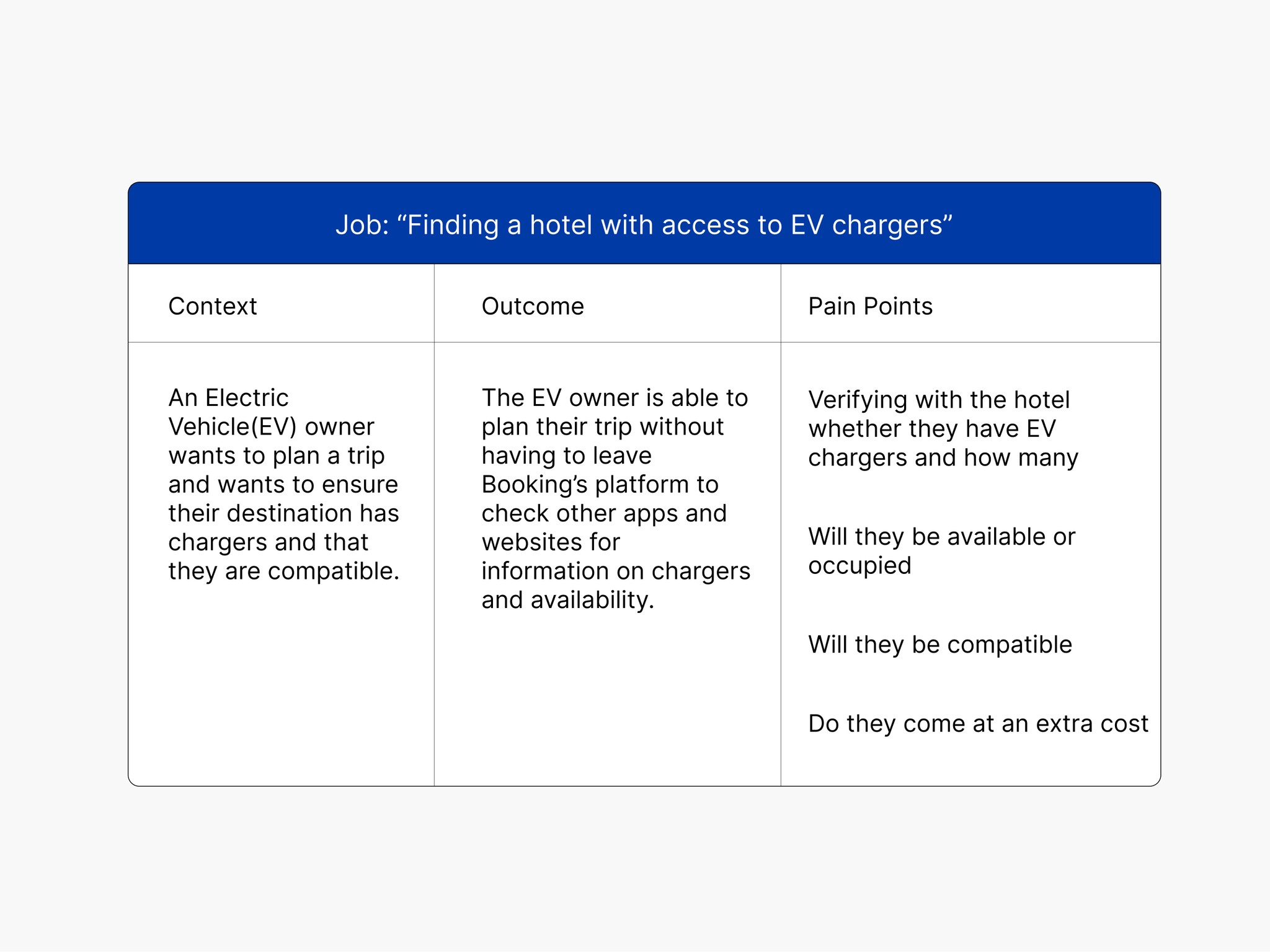
Target audience and JTBD
Ideation
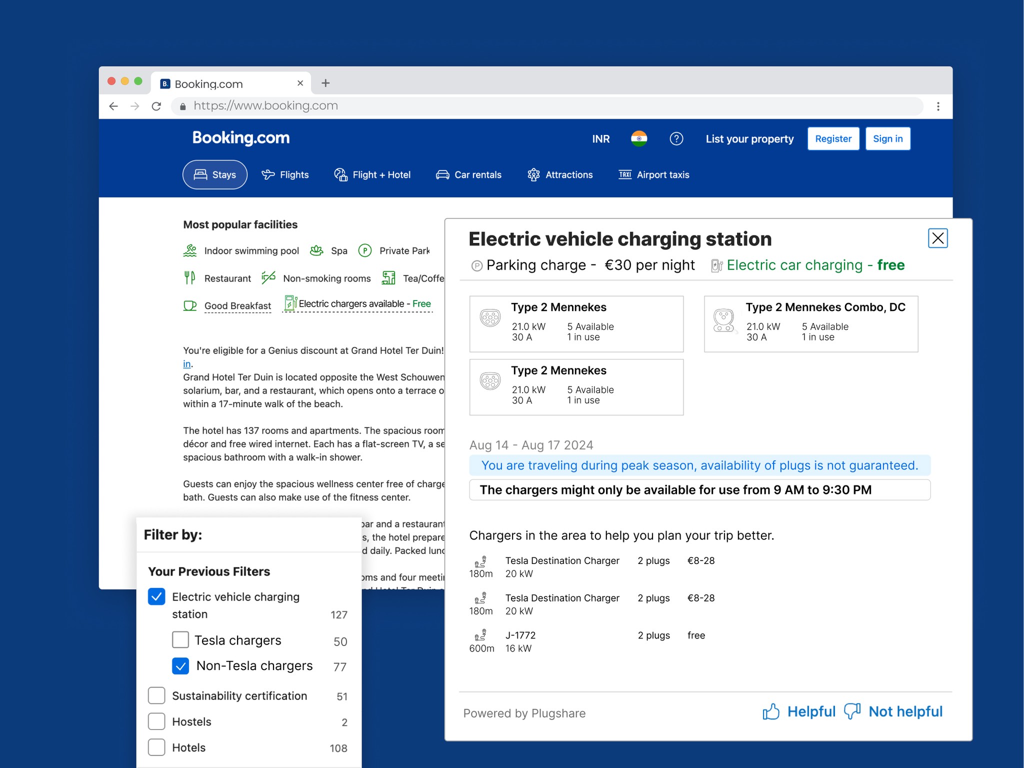
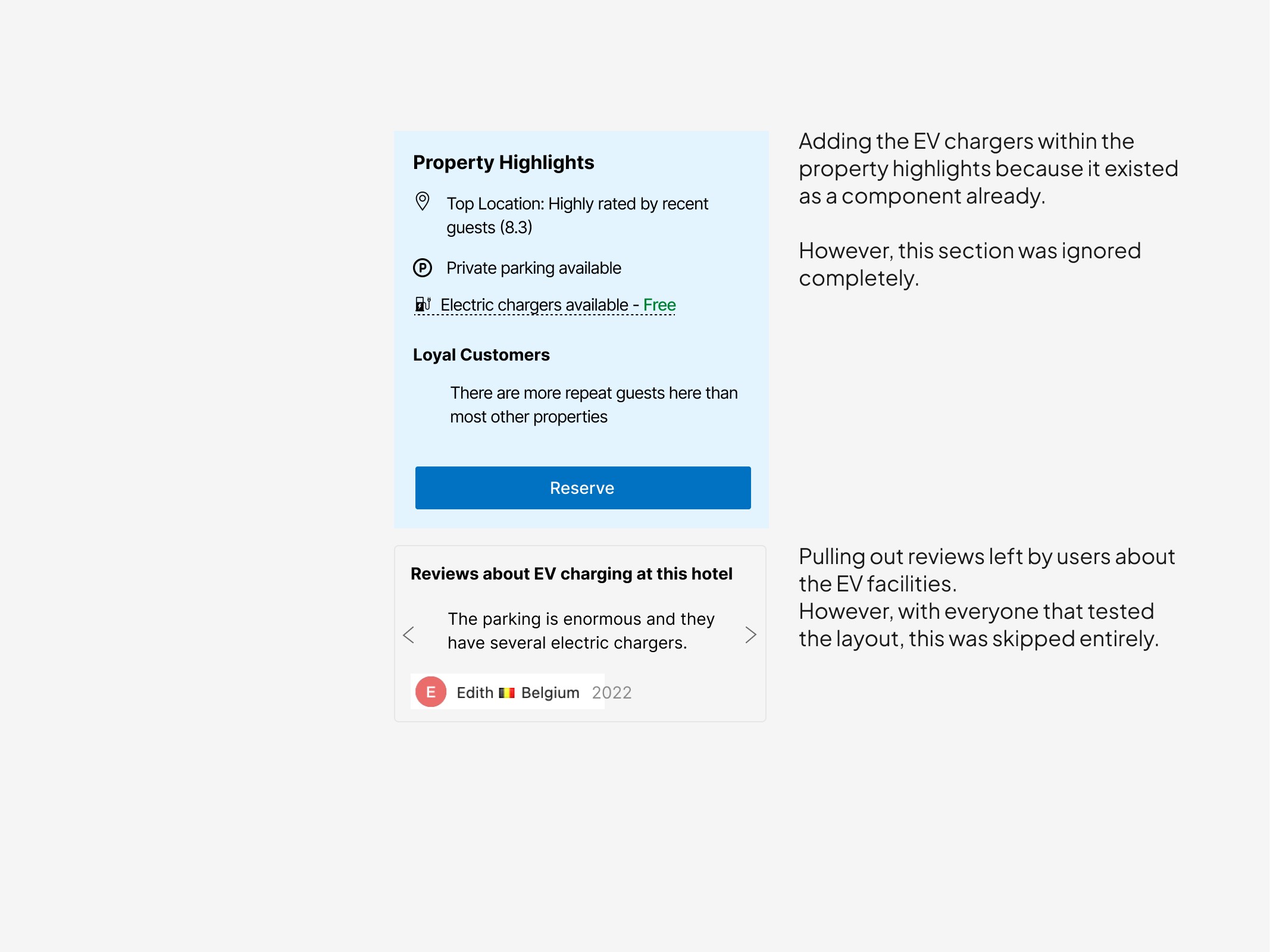
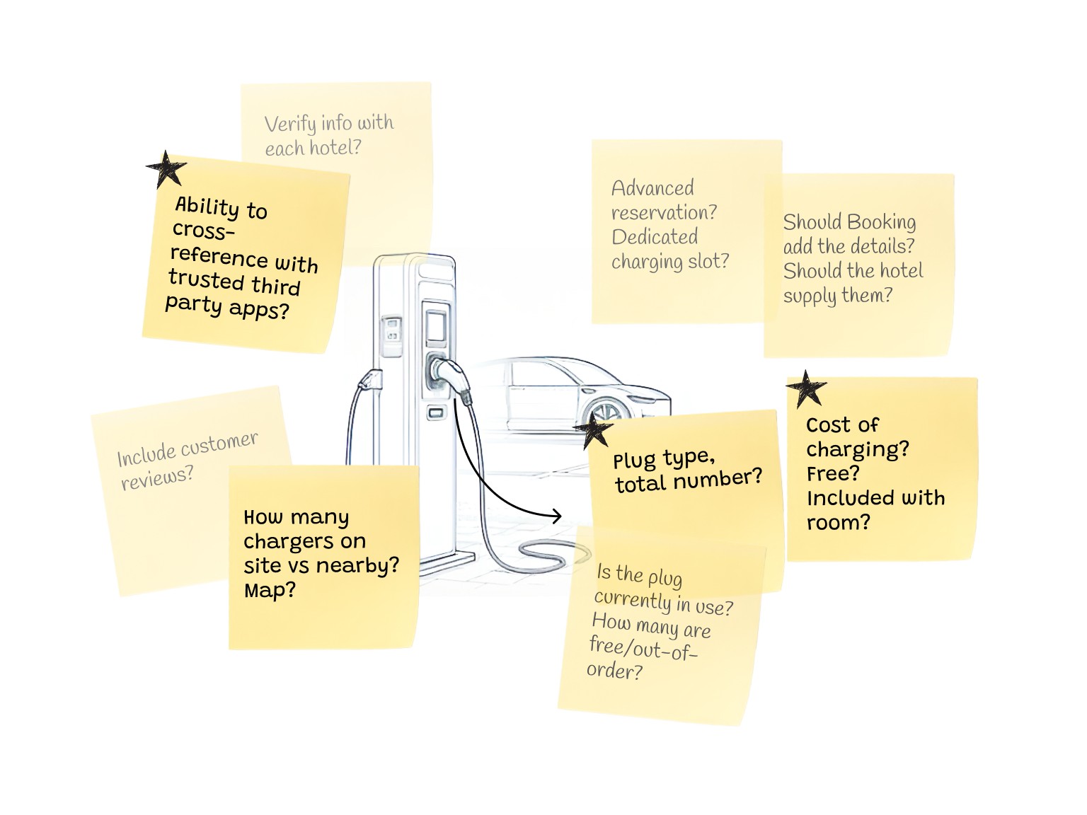
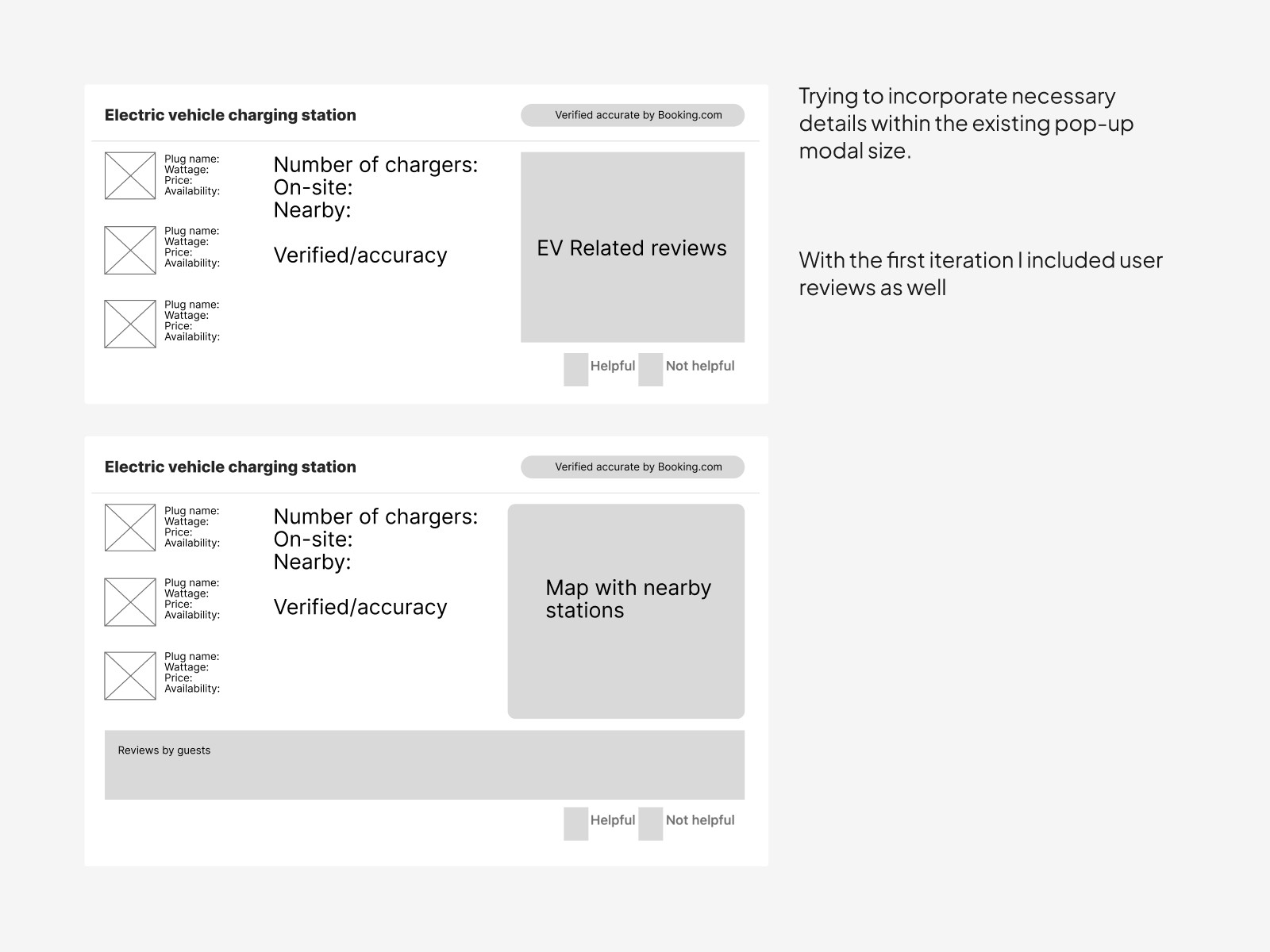
I assessed the existing layout and decided there were multiple points where I could include the necessary information.
What information would enable an EV owner to make an informed decision?

User Testing
I used BallparkHQ to carry out unmoderated usability tests.

What I learned
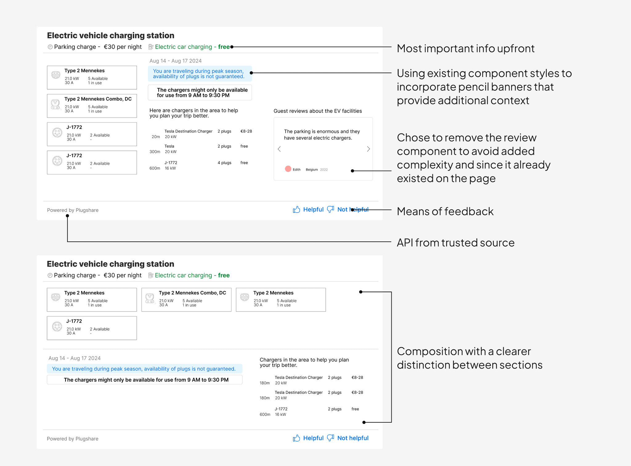
Placement of info
Where the info was placed was important. Users expected it within the filters section as well as right on top above the fold of the individual hotel page.
8/11 users found the info fairly easily
Users didn't know how many ports were available and whether they were in use.
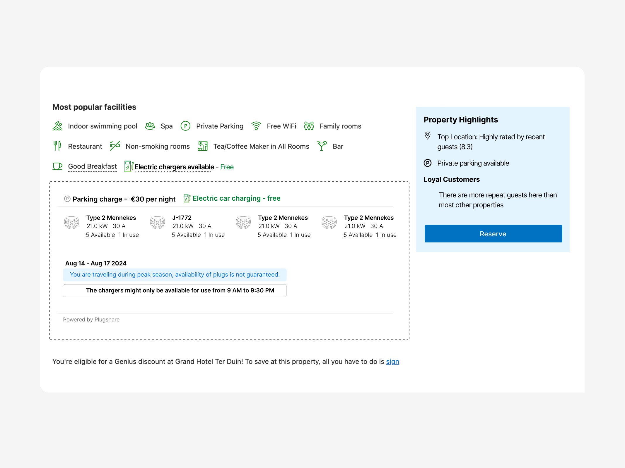
Reduced friction while planning for EV owners - a success?
This feature enables travellers to cut down the number of steps involved while planning a trip.
It also keeps the user on the same platform while making the booking ensuring a more hassle-free overall experience.
What I'd do differently - if this were a real project
Booking.com prides itself on data-led design decisions. Here's how I'd measure success:
Accuracy over time
Did the information stay accurate over an extended period.
Bounce rate
Did users stay on Booking.com's platform?
CSAT scores
Did we see an improvement in CSAT?